So far I have focused very heavily on reproducibility, that is, the ability to generate the same answer when code is run repeatedly. However, it’s easy to reliably generate the wrong answer! In measurement theory there is a fundamental distinction between reliability and validity: Reliability means performing the same method repeatedly results in highly similar results, whereas validity refers to whether the estimated result is close to the true result. In this chapter we turn to the validation of scientific software, by which I mean the degree to which it performs the intended task as expected and gets the answers right.
Creating simulations
Creating simulations is perhaps the most important tool that computers offer the scientist, as captured in a well-worn quote by Press, 1992:
offered the choice between mastery of a five-foot shelf of analytical statistics books and middling ability at performing statistical Monte Carlo simulations, we would surely choose to have the latter skill. (p.691)
Simulations are indeed a powerful way to understand a system even when it’s not analytically tractable. More importantly, they are generally the only way that we can establish ground truth against which we can compare our models. As scientists we never know the true process that generates our data, but with simulations we can have complete control over the data generation process.
My previous book, Statistical Thinking Poldrack, 2023, gives an overview of how to use simulations in the context of statistics; here I will focus primarily on the use of simulation in the context of software validation, but I recommend that book for background reading if you aren’t already familiar with the concept of a statistical distribution.
Generating random numbers
The most fundamental requirement in nearly any simulation is the ability to generate random numbers.[1] What makes a series of numbers random is that it is impossible (or at least nearly impossible) to predict the next value in the series. Random numbers are defined by the distribution that characterizes them, which is a mathematical function that describes the “shape” of the data when they are summarized according to the relative frequency of different values or ranges of values. Picking the correct distribution is essential to ensure that any simulation performs as advertised. Fortunately, there are lots of existing packages that provide tools to generate random numbers for nearly any distribution; we will focus on the NumPy package here since it is the most commonly used.
The simplest distribution is the uniform distribution, in which any possible value (within a particular range for continuous values) has the same probability of occurring. We can generate uniform random variates by first creating a random number generator object using np.random.default_rng(), and then calling rng.uniform() which returns random samples from the distribution:
rng = np.random.default_rng()
rng.uniform(size=10)
array([0.56449692, 0.6880841 , 0.43249236, 0.28950554, 0.02708363,
0.61239335, 0.30663968, 0.3854357 , 0.57454511, 0.07974661])In this case, rng.uniform() by default generates floating point values that fall within [0, 1]; this can be changed using the location and scale parameters to the function. If we generate a large number of these then we can create a distribution plot (often called a histogram) showing how the numbers are distributed, as shown in Figure 1.
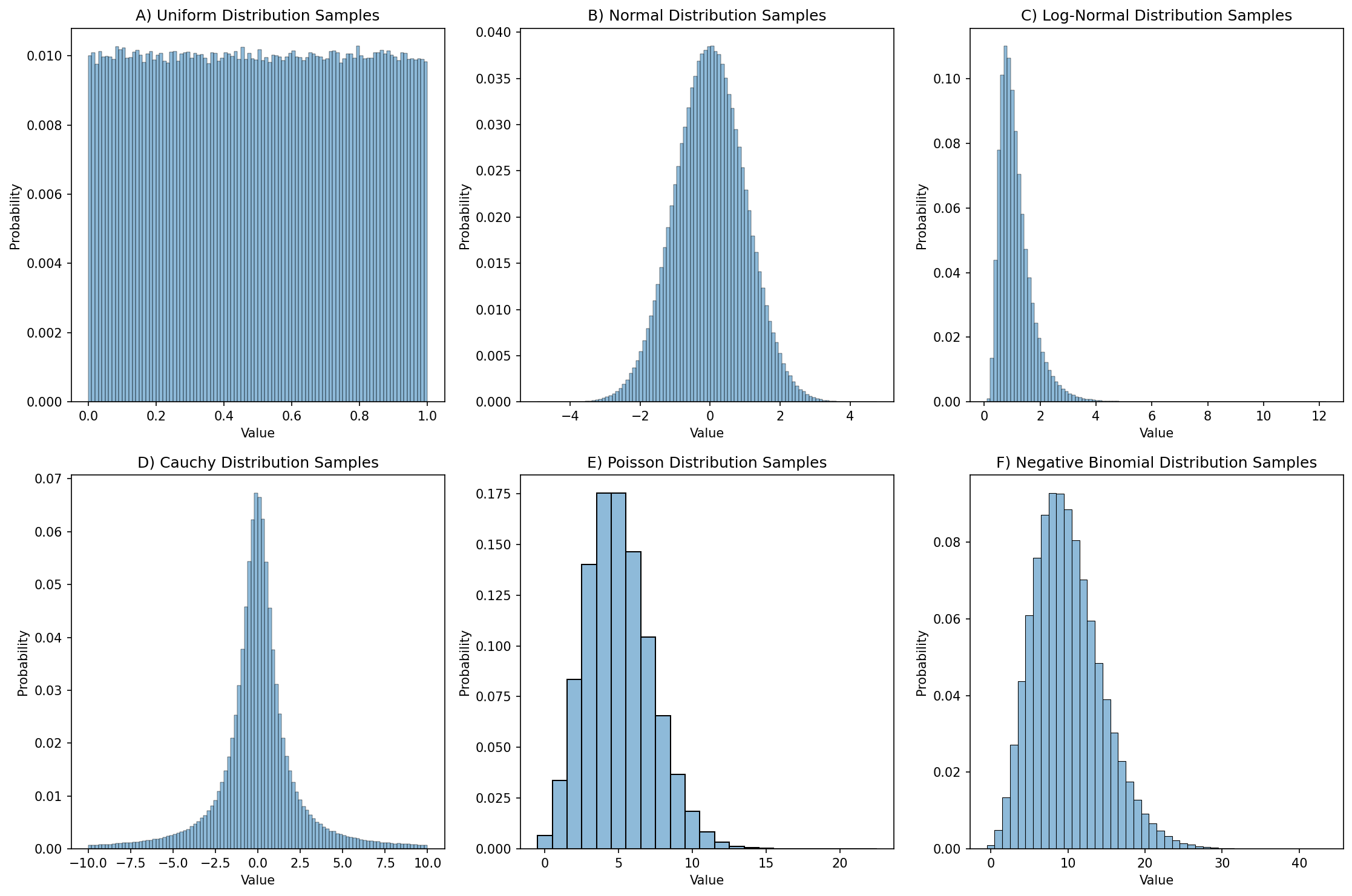
Figure 1:Distribution plots for 1,000,000 random samples from each of six different distributions.
For purposes of reproducibility it’s often useful to be able to regenerate exactly the same series of random samples. We can do this by specifying a random seed, which gives the random number generating a starting point. If you are going to do simulations then it is important to understand the specific random number generator that your code will use. This blog post provides an excellent introduction to the NumPy random generation system; here I will only give a brief overview. Previously it was common to use the global NumPy random seed function (np.random.seed()) to set the seed, and this is still necessary when using packages that access the global random number generator. However, the best practice is to generate a random number generator object (using np.random.default_rng()), and then call the methods of that object to obtain random numbers, as I did above. This prevents surprises in case other functions modify the global seed, helps isolate your specific generator, and enables multiple parallel generators. Here is an example:
rng = np.random.default_rng(seed=42)
rng.uniform(size=4)
array([0.77395605, 0.43887844, 0.85859792, 0.69736803])If we run this again, we see that a different series of numbers is generated:
rng.uniform(size=4)array([0.09417735, 0.97562235, 0.7611397 , 0.78606431])However, if we generate another object with the same seed, we will see that it gives us the same values as above:
rng2 = np.random.default_rng(seed=42)
rng2.uniform(size=4)
array([0.77395605, 0.43887844, 0.85859792, 0.69736803])rng2.uniform(size=4)array([0.09417735, 0.97562235, 0.7611397 , 0.78606431])Setting random seeds is important to enable exact reproducibility of results generated using random numbers. However, it’s also important to ensure that one’s results are robust to the choice of random seed, as I will discuss later in the context of machine learning analyses.
Choosing a distribution
Choosing the right distribution for a simulation often comes down to understanding the data-generating process and kind of data that are being modeled. Here are a few examples of distributions and their common use cases:
Discrete outcomes
Bernoulli: A distribution of binary outcomes (often interpreted as success vs failure) given a probability of a positive outcome.
Examples: Whether a patient responds to a given treatment, whether a hard drive fails within a particular period of time.
Binomial: A distribution of the number of successes across a specific number of Bernoulli trials, given a probability of a positive outcome.
Examples: The number of patients who respond to treatment in a clinical trial treatment group, the number of hard drives that fail within a particular period of time at a particular data center
Categorical: A distribution with several distinct possible outcomes, each of which has a particular probability:
Examples: Eye color across a population, programming languages used by programmers in a company
Uniform: A specific form of a discrete categorical variable with equal probability
Examples: equiprobable physical outcomes such as a dice roll.
Multinomial: A multivariate generalization of the binomial, representing the counts of multiple possible outcomes across a set of independent trials with fixed probabilities of each outcome.
Examples: Frequencies of types of stars in a galaxy, frequencies of cell types in a tissue sample
Continuous outcomes:
Uniform: A distribution with equal probability density for all values within the range.
Examples: probabilities of events when there is no prior knowledge, equiprobable continuous physical outcomes
Beta: A generalization of the uniform distribution that models the probability of values within a range but allows different values to have different probabilities.
Examples: Prior probabilities in a Bayesian model, proportions of time spent in a particular state.
Normal (or Gaussian): A symmetric distribution centered around a mean, which commonly arises when an outcome is generated based on many small additive contributions. The Central Limit Theorem explains why this occurs so frequently, as it should arise for sums of independent random variables sampled from any distribution, as long as the sample size is large enough and the distribution has finite variance.
Examples: Height of individuals in a population, measurement errors for continuous variables
Log-normal: Distribution of positive continuous values whose logarithm is normally distributed. It reflects the expected values of a product of independent random variables.
Examples: Wealth and income distributions in a population, biological growth processes
Count data:
Poisson: This is a distribution of counts of events within a fixed interval assuming that the events are independent and occur at a constant rate. Unlike the binomial there is no limit on the number of events that can occur, and it is the limiting case of the Binomial when the sample size approaches infinity and the probability approaches zero (and remains constant).
Examples: The number of atoms decaying within a particular period, the number of emails that a person receives within a day
Negative binomial: A distribution that models count data that are overdispersed, meaning that their variance is greater than their mean. It can also be interpreted as representing the number of failures that occur before a given number of successes.
Example: Commonly used in genomics to model read counts in genomic sequencing.
Waiting time data:
Exponential: A distribution of waiting times in a process governed by a Poisson distribution, with a constant hazard rate (i.e. the probability of happening in the next period is independent of whether the event has happened yet).
Examples: Time between atomic decays, time between hard drive failures
Weibull: A generalization of the exponential distribution that allows modeling of waiting times with increasing, constant, or decreasing hazard rates.
Examples: Response times in human behavior, time to failure for some electronic devices
It is essential to choose the right distributions for a simulation; otherwise the results may be misleading at best or meaningless at worst.
Simulating data from a model
In some cases, we want to simulate data that have particular structure in order to test whether our code can properly identify the structure in the data. Depending on the kind of structure one needs to create, there are often existing tools that can help generate the data. For example, the scikit-learn package has a large number of data generators that are often useful, either on their own or as a starting point to develop a custom generator. Similarly, the NetworkX graph analysis package has a large number of graph generators available.
Let’s say that we have developed a tool that implements a novel method for the discovery of causal relationships from timeseries data. We would like to generate data from a known causal graph (which is represented as a directed acyclic graph, just like our workflow graphs in the previous chapter). For this, we can use an existing graph; I chose one based on a dataset of gene expression in E. coli bacteria that was used by Schäfer & Strimmer, 2005 and is shared via the pgmpy package:
from IPython.display import Image
from pgmpy.utils import get_example_model

# Load the model
ecoli_model = get_example_model('ecoli70')

# Visualize the network and save to an image file
viz = ecoli_model.to_graphviz()
viz.draw(IMAGE_DIR / 'ecoli.png', prog='dot')
Figure 2 shows the resulting rendering of that network, which has 46 nodes (representing individual genes) and 70 directed edges (representing causal relationships on gene expression between nodes).
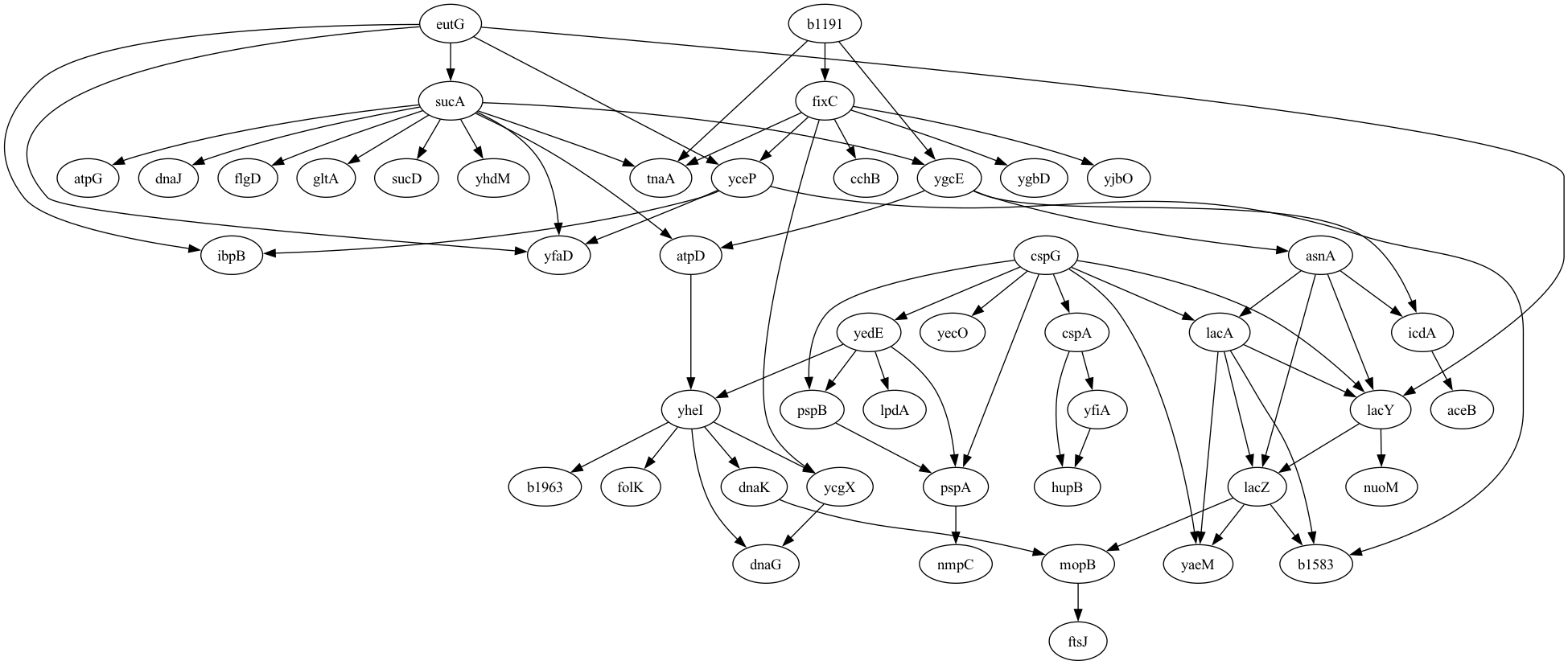
Figure 2:A plot of the graphical model for the E. Coli gene expression data generated by Schäfer & Strimmer, 2005.
Given this DAG, we then need to generate timeseries data for expression of each gene that reflect the causal relationships between the genes as well as the autocorrelation in gene expression within genes measured over time. For this, we turn to the tigramite package, which is primarily focused on causal discovery from timeseries data, but also includes a function that can generate timeseries data given a graphical model. However, the tigramite package requires a different representation of the graphical model than the one obtained from pgmpy, so we have to convert the edge representation from the original to the link format required for tigramite:
def generate_links_from_pgmpy_model(model, coef=0.5, ar_param=0.6):
    nodes, edges = model.nodes(), model.edges()
    noise_func = lambda x: x
    links = {}

    # create dicts mapping node names to indices and vice versa
    node_to_index = {node: idx for idx, node in enumerate(nodes)}
    index_to_node = {idx: node for node, idx in node_to_index.items()}

    # add edges from the pgmpy model
    for edge in edges:
        cause = node_to_index[edge[0]]
        effect = node_to_index[edge[1]]
        # for simplicity, use lag 1, constant coef and no edge noise
        links.setdefault(effect, []).append( ((cause, -1), coef, noise_func) )

    # add a self-connection to all nodes to simulate autoregressive behavior
    for node in nodes:
        idx = node_to_index[node]
        links.setdefault(idx, []).append( ((idx, -1), ar_param, noise_func) )

    return links, node_to_index, index_to_node
We can then create a function to take in the original model, convert it, and generate timeseries data for the model:
def generate_data(model, noise_sd=1, tslength=500, seed=42, coef=0.5, ar_param=0.6):
    links, node_to_index, index_to_node = generate_links_from_pgmpy_model(model,
        coef=coef, ar_param=ar_param)
    rng = np.random.default_rng(seed)
    # Calculate total length including transient period
    data, _ = structural_causal_process(links, T=tslength, seed=seed)
    data = rng.normal(scale=noise_sd, size=data.shape) + data
    # Prepare data for tigramite
    return DataFrame(data), index_to_node

# we will need the index_to_node mapping later
ecoli_dataframe, _, index_to_node = generate_data(ecoli_model, noise_sd=1,
    tslength=500, seed=42)
Now that we have the dataset we can test out our estimation method. Since I don’t actually have a new method for causal estimation on timeseries, I will instead use the PCMCI method described by Runge et al., 2019 and implemented in the tigramite package:
from tigramite.pcmci import PCMCI
from tigramite.independence_tests.parcorr import ParCorr

def run_pcmci(dataframe):
    # Initialize PCMCI with partial correlation-based independence test
    pcmci = PCMCI(dataframe=dataframe, cond_ind_test=ParCorr())
    # Run PCMCI to discover causal links
    results = pcmci.run_pcmci(tau_max=1, pc_alpha=None)
    return results

results = run_pcmci(ecoli_dataframe)
The results from this analysis include a list of all of the edges that were identified from the data using causal discovery, which we can summarize to determine how well the model performed. First we need to extract the links that were discovered from the results which pass our intended false discovery rate threshold:
def extract_discovered_links(results, index_to_node, q_thresh=0.00001):
    discovered_links = []
    fdr_p = results['fdr_p_matrix'][:, :, 1]  # use only lag 1 p-values
    links = np.where(fdr_p < q_thresh)
    for (i, j) in zip(links[0], links[1]):
        if not i == j:
            discovered_links.append((index_to_node[i], index_to_node[j]))
    return discovered_links

discovered_links = extract_discovered_links(results, index_to_node, .01)
Then we can summarize the results:
def get_edge_stats(edges, discovered_links, verbose=True):
    true_edges = set(edges)
    discovered_edges = set(discovered_links)
    true_positives = true_edges.intersection(discovered_edges)
    false_positives = discovered_edges.difference(true_edges)
    false_negatives = true_edges.difference(discovered_edges)

    true_positive_rate = len(true_positives) / len(true_edges) if len(true_edges) > 0 else 0

    # Precision: proportion of discoveries that are true
    precision = len(true_positives) / len(discovered_edges) if len(discovered_edges) > 0 else 0

    # False Discovery Rate: proportion of discoveries that are false
    false_discovery_rate = len(false_positives) / len(discovered_edges) if len(discovered_edges) > 0 else np.nan

    f1_score = (2 * len(true_positives)) / (2 * len(true_positives) + \
        len(false_positives) + len(false_negatives)) if (len(true_positives) + len(false_positives) + len(false_negatives)) > 0 else np.nan

    if verbose:
        print(f'{len(true_edges)} true edges')
        print(f'discovered {len(discovered_edges)} edges')
        print(f"True Positive Rate (Recall): {true_positive_rate:.2%}")
        print(f"Precision: {precision:.2%}")
        print(f"False Discovery Rate: {false_discovery_rate:.2%}")
        print(f"F1 Score: {f1_score:.2%}")

    return {
        'true_positives': true_positives,
        'false_positives': false_positives,
        'false_negatives': false_negatives,
        'true_positive_rate': true_positive_rate,
        'precision': precision,
        'false_discovery_rate': false_discovery_rate,
        'f1_score': f1_score
    }

edge_stats = get_edge_stats(ecoli_model.edges(), discovered_links)
70 true edges
discovered 87 edges
True Positive Rate (Recall): 100.00%
Precision: 80.46%
False Discovery Rate: 19.54%
F1 Score: 89.17%The results showed that the model performed quite well, detecting all of the true relationships and only two false relationships. In general we would want to do additional validation to make sure that the results behave in the way that we expect. For example, we would expect better model performance with stronger signal, and we would expect fewer nodes identified when the p-value threshold is more stringent. We can use the functions generated above to run a simulation of this:
# loop over signal levels and q values to see effect on performance

noise_sd = 1
tslength = 500
q_values =  [1e-6, 1e-5, 1e-4, 1e-3, 1e-2]
signal_levels = np.arange(0, 0.7, 0.1)
performance_results = []

for signal_level in signal_levels:
    dataframe, index_to_node = generate_data(ecoli_model, noise_sd=noise_sd, tslength=tslength, seed=42, coef=signal_level, ar_param=0.6)
    results = run_pcmci(dataframe)
    for q in q_values:
        discovered_links = extract_discovered_links(results, index_to_node, q_thresh=q)
        edge_stats = get_edge_stats(ecoli_model.edges(), discovered_links, verbose=False)
        performance_results.append({
        'noise_sd': noise_sd,
        'q_value': q,
        'tslength': tslength,
        'signal_level': signal_level,
        'true_positive_rate': edge_stats['true_positive_rate'],
        'precision': edge_stats['precision'],
        'false_discovery_rate': edge_stats['false_discovery_rate'],
        'f1_score': edge_stats['f1_score']
    })

performance_df = pd.DataFrame(performance_results)
We can then plot these results, as shown in Figure 3. The results confirm that the model is performing as expected, with increasing recall as a function of increasing true signal and decreasing FDR threshold.
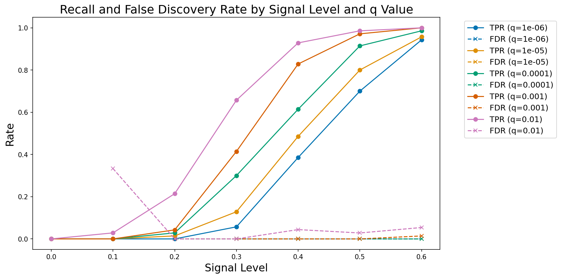
Figure 3:A plot of observed true positive rate (TPR) and false discovery rate (FDR) at increasing signal levels for varying FDR thresholds.
Simulating data based on existing data
It’s very common for researchers to collect a dataset of interest and then develop code that implements their analysis on that dataset to ask their questions of interest. However, this approach raises a concern that the choices made in the course of analysis might be biased by the specific features of the dataset Gelman & Loken, 2019. In particular, decisions might be made that reflect the noise in the dataset, rather than the true signal, which is often referred to as overfitting (discussed further below). In some fields (particularly in physics) it is common to perform blind analysis MacCoun & Perlmutter, 2015, in which analysts are given data that are either modified or relabeled, in order to prevent them from being biased by their hypotheses. One way to achieve this in the context of data analysis is to develop the code using a simulated dataset that has some of the same features as the real dataset, such that one can implement the code, validate it, and then immediately apply it to the real data once they are made available. To achieve this, one needs to be able to generate simulated data based on an existing dataset; for blind analysis, the generation of the simulated data should be performed by a different member of the research team. For example, in some cases I have generated the simulated data for a study based on the real data and provided those to my students, only providing them with the real data once the code was implemented and validated.
The important question in generating simulated data from real data is what specific features one intends to capture from the real data. This generally will require some degree of domain expertise in order to understand the features of the data. Some common features that one might wish to replicate are:
Data types (e.g. categorical, integer, floating point)
Marginal distributions of the values (minimally the range, preferably the shape or summary statistics)
Joint distributions of the variables (e.g. capturing correlations between variables)
It’s generally important to avoid including features in the model that are directly relevant to the hypothesis. For example, if the hypothesis relates to correlations between specific variables in the dataset, then the correlation in the simulated data should not be based on the correlation in the real data, lest the analysis be biased.
Here I will focus primarily on tabular data; while there are simulators to generate more complex types of data, such as genome wide association data and functional magnetic resonance imaging data Ellis et al., 2020, these require substantial domain expertise to use properly, whereas tabular data are widely applicable. For simple datasets it may be most appropriate to generate simulated data by hand; here I will use the Synthetic Data Vault (SDV) Python package, which has powerful tools for generating many kinds of synthetic data.
As an example, I will use the Eisenberg data that you have already seen on a couple of occasions. I’ll start by picking out a few variables and then using SDV to create a synthetic dataset whose distributions for each variable match those in the original, but the columns are generated independently, which removes any correlations between columns. The full analysis is shown [here]. After loading and combining the demographic and behavioral data frames, selecting a few important variables, and joining them into a single frame (df_orig), I then use SDV to generate simulated data for each variable, shuffling each column after generation to destroy any correlations:
from sdv.single_table import GaussianCopulaSynthesizer
from sdv.metadata import Metadata

def generate_independent_synthetic_data(df, random_seed=42):
    """
    Generate synthetic data where all variables are independent.

    Uses SDV to model the full dataset, then shuffles each column
    independently to break all correlations while preserving marginal distributions.

    Parameters:
    -----------
    df : pd.DataFrame
        Original dataframe to generate synthetic version of
    random_seed : int, optional
        Random seed for reproducibility (default: 42)

    Returns:
    --------
    pd.DataFrame
        Synthetic dataframe with same shape and column names as input,
        but with independent variables
    """
    # Suppress the metadata saving warning
    warnings.filterwarnings('ignore', message='We strongly recommend saving the metadata')

    # Set random seed
    if random_seed is not None:
        np.random.seed(random_seed)

    # Create metadata for the full dataset
    metadata = Metadata.detect_from_dataframe(
        data=df,
        table_name='full_data'
    )

    # Create synthesizer for the full dataset
    synthesizer = GaussianCopulaSynthesizer(
        metadata,
        enforce_rounding=False,
        enforce_min_max_values=True,
        default_distribution='norm'
    )

    # Fit synthesizer to the full dataset
    synthesizer.fit(df)

    # Generate synthetic data
    df_synthetic = synthesizer.sample(num_rows=len(df))

    # CRITICAL: Shuffle each column independently to break all correlations
    # This preserves the marginal distribution of each variable but eliminates dependencies
    for col in df_synthetic.columns:
        shuffled_values = df_synthetic[col].values.copy()
        np.random.shuffle(shuffled_values)
        df_synthetic[col] = shuffled_values

    return df_synthetic
We can then visualize the correlations and distributions for the original data and the synthetic data; in Figure 4 we see that the distributions in the synthetic data are very similar to those in the original data, while Figure 5 we see that the synthetic data do not include the original correlations.
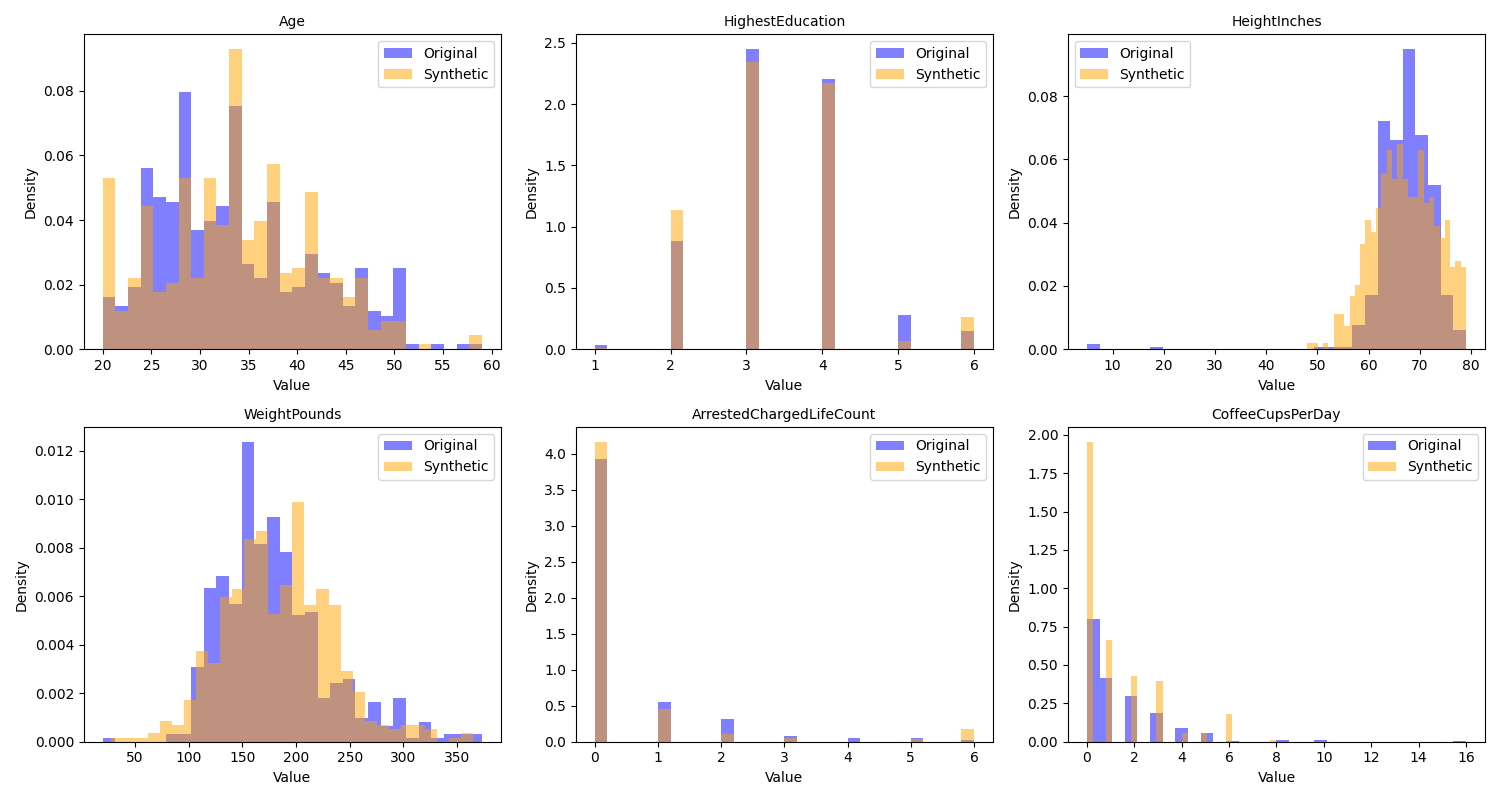
Figure 4:A comparison of the distributions of the original and synthetic data for several of the variables in the example dataset.
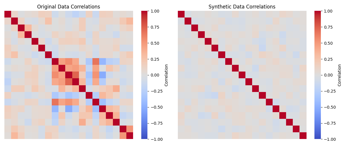
Figure 5:A comparison of the correlations matrices for the numeric variables in the original and synthetic data.
The SDV package also offers many additional tools for more sophisticated generation of synthetic data. We will see below additional ways to use synthetic data for validation of scientific data analysis code.
Estimating model parameters
It is very common in science to collect data and then use those data to estimate the parameters for a given model, and it’s important to be able to validate that the estimates are valid. Given the central role of parameter estimation in code testing and validation, I now dive into the various methods that one can use to estimate model parameters, and show examples of how we might validate them. In addition to estimating model parameters, we generally also want some kind of way to quantify the uncertainty in our estimates. That is, rather than thinking of the parameter estimate as a single point value, we can ask: What range of values for the parameter are consistent with the data? This is often expressed using confidence intervals, though I will discuss below the ways that these are often misunderstood.
A central idea in this section will be the notion of parameter recovery: that is, how well can our estimation procedure recover the true parameter values using simulated data? This is particularly important in cases where we don’t have statistical guarantees on the unbiasedness of our estimates. As we will see, simulation provides a powerful tool to assess parameter recovery performance for any model.
Closed-form estimates
In some cases parameter estimates can be obtained using a closed form analytic solution. We will use the normal distribution as an example. This distribution has two parameters: a mean (sometimes called a location) that specifies where the center of the distribution falls, and a standard deviation (sometimes called a scale) that specifies the width of the distribution. The probability function for the normal distribution is:
where is the mean and is the standard deviation.
Our goal in estimating model parameters is to find estimates (in this case for the mean and standard deviation) that maximize some measure of goodness of fit with respect to the data, or equivalently, minimize some measure of error. Since we don’t want positive and negative errors to cancel each other out, we need a measure of error that is uniquely positive regardless of the direction of the error. The most common measure in statistics is the mean squared error:
where is the value for the i-th observation, is the estimated value for that observation from the model, and is the sample size. In the case of the normal distribution, is the same for each observation: the mean. We can estimate the mean for the sample using the closed form solution:
where is the mean. We can then compute the standard deviation using this estimated mean:
Note that this is very similar to the mean squared error, differing in the presence of a square root as well as the use of rather than in the demominator. The latter is meant to adjust for the fact that we lost one degree of freedom when we estimated the mean from the same data and then used it to compute the standard deviation. When the variance (the square of the standard deviation) is computed using this correction it will be unbiased, meaning that its expected value will match the true variance of the population. The standard deviation is still slightly biased, but less so than the one computed without the correction.
Figure Figure 6 shows an example of a histogram based on samples from a normal distribution, with the theoretical normal distribution based on the estimated sample mean and standard deviation overlaid. Visually it’s clear that the fitted distribution characterizes the overall shape well, even if it mismatches the shape at finer grain, due to sampling variability.
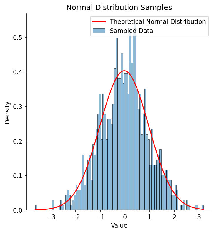
Figure 6:A histogram of 1000 samples from a standard normal distribution (with mean of zero and standard deviation of one), with the fitted normal distribution overlaid in red.
Quantifying uncertainty in closed-form estimation
In general we want not just a point estimate for our parameter but also an estimate of our uncertainty in that estimate. The confidence interval is the most commonly used method for expressing uncertainty around an estimate, and with closed form expressions it’s often possible to compute the confidence interval directly. A confidence interval is expressed in terms of a percentage, but the meaning of this percentage is often misinterpreted (see the discussion in my Statistical Thinking for more on this). The term “95% confidence interval” seems to imply that it is an interval in which we have 95% confidence that the true value of the parameter falls. However, that violates the frequentist statistical logic that underlies the computation of the confidence interval, which treats the true value as fixed, and thus it either falls in the interval or it doesn’t. Instead, the more appropriate interpretation of a frequentist confidence interval is that it is the interval that would capture the true population mean 95% of the time for samples from the same population. I prefer to frame it in a slightly different, if somewhat less precise way: The confidence interval expresses the range of plausible values for the parameter given our data, and thus tells us something about the precision of our estimate.
Using our example from above, we can compute a confidence interval for our estimate of the sample mean. This requires that we have a probability distribution that is associated with our statistic; in this case, the Student’s t distribution is appropriate since we have estimated the standard deviation as well as the mean. The t distribution has slightly wider tails than the normal distribution, which helps account for the added uncertainty in our estimate of the standard deviation. The equation for the confidence interval around the mean using the t distribution is:
where is the sample standard deviation, is the sample size, and is the critical value of the t distribution with degrees of freedom at the percentile. defines our confidence level, and it is divided by two since we are interested in both the positive and negative directions. In our case, this results in a confidence interval of [-0.09028, 0.03249]. We can use a simulation to confirm that this interval indeed captures the sample mean 95% of the time for new samples from the same distribution:
# Simulation parameters
n_simulations = 100000
confidence_level = 0.95
alpha = 1 - confidence_level
random_state = 42
true_mean, true_sd = 0, 1
sample_size = 1000

# Track how many times the CI captures the true mean
captures = 0

# Run simulations
for i in range(n_simulations):
    # Draw a new sample from the population
    sample = norm.rvs(loc=true_mean, scale=true_sd,
        size=sample_size, random_state=random_state)

    # Calculate sample statistics
    sample_mean_sim = np.mean(sample)
    sample_sd_sim = np.std(sample, ddof=1)

    # Calculate confidence interval
    df = sample_size - 1
    t_crit = t.ppf(1 - alpha/2, df)
    se = sample_sd_sim / np.sqrt(sample_size)
    margin = t_crit * se

    ci_low = sample_mean_sim - margin
    ci_high = sample_mean_sim + margin

    # Check if CI captures the true mean
    if ci_low <= true_mean <= ci_high:
        captures += 1

# Calculate coverage rate
coverage_rate = captures / n_simulations

print(f"Simulation results:")
print(f"Number of simulations: {n_simulations}")
print(f"Sample size per simulation: {sample_size}")
print(f"True population mean: {true_mean}")
print(f"Confidence level: {confidence_level * 100}%")
print(f"\nCoverage rate: {coverage_rate:.4f} ({coverage_rate * 100:.2f}%)")
Simulation results:
Number of simulations: 100000
Sample size per simulation: 1000
True population mean: 0
Confidence level: 95.0%
Coverage rate: 0.9503 (95.03%)Here we see that the observed proportion of samples where the sample mean falls within the confidence interval is very close to the 95% that we expect based on statistical theory.
The bootstrap as a general method for quantifying uncertainty
There are often cases where we don’t have a sampling distribution that we can use to form a confidence interval. In these cases, we can use a technique known as the bootstrap. This method takes advantage of resampling, meaning that we repeatedly draw samples with replacement from our full sample. We can do this using the scipy.stats.bootstrap() function, which performs the bootstrap on a sample given any statistical function:
from scipy.stats import bootstrap

# use the bias-corrected/accelerated method ('BCa')
res = bootstrap((normal_samples,), np.mean, confidence_level=0.95,
    n_resamples=10000, method='BCa', random_state=random_state)

print(f'Bootstrap 95% CI for mean: '
    f'[{res.confidence_interval.low:.5f}, '
    f'{res.confidence_interval.high:.5f}]')
print(f'CI based on t-distribution: [{ci_lower:.5f}, {ci_upper:.5f}]')
Bootstrap 95% CI for mean: [-0.09104, 0.03078]
CI based on t-distribution: [-0.09028, 0.03249]Here we see that the bootstrap procedure gives results that are very close to those obtained using the closed form solution, but has the advantage of being usable with nearly any statistic (except for those based on extreme values) regardless of whether or not there is a closed form estimator and/or the sampling distribution is analytically tractable.
Bayesian estimation
I noted above that the interpretation of the frequentist confidence interval is counterintuitive for most people, which leads to common misunderstandings, even among experts Hoekstra et al., 2014. We would like a way of generating an interval that expresses our confidence about the true parameter value, but we can’t do this in the frequentist framework. However, there is a different approach to statistics that allows us to generate such an interval, known as Bayesian statistics after the Reverend Thomas Bayes whose famous equation forms the basis of this approach.
Bayesian statistics is based on a different conception of probability from the frequentist approach that underlies the standard confidence interval. Under the frequentist conception, probabilities are meant to refer to the long-run frequencies of outcomes across many samples, while the true parameter value is viewed as fixed. For this reason, it doesn’t make sense to a frequentist to say that there is a particular probability of the true parameter value; it simply is what it is. Bayesians, on the other hand, view probabilities as degrees of belief, and treat the estimation of parameters from data as a way to sharpen our belief - that is, as a learning opportunity. This means that it is perfectly legitimate in the Bayesian framework to say that there is a 95% probability that the true value of a parameter lies within a particular interval.
The fundamental idea in Bayesian statistics is that we start with a set of beliefs (known as a prior distribution), we obtain some relevant data, and then use the likelihood of those data given the possible parameter values to update our beliefs, generating a posterior distribution. I won’t go into detail about Bayesian methods here; see my Statistical Thinking for a basic overview, and Gelman, 2013 or McElreath, 2020 for more detailed overviews. Instead I will show an example of Bayesian estimation applied to our example data above. There are several Python packages that can be used to perform Bayesian estimation; I will use the popular PyMC package. The first section sets up the Bayesian model, with priors for the mean (mu) and standard deviation (sigma) that are very broad and thus will have little influence on the outcome; in Bayesian terms these are referred to as weakly informative priors. We then perform sampling to obtain an estimate of the posterior distribution of the parameters given the data. Using these distributions, we can then find the narrowest set of values that contain 95% of the mass of posterior distribution, which are known as the highest density interval (HDI) (which is a type of credible interval that contains the most likely values). This interval serves as a Bayesian alternative to the frequentist confidence interval, allowing us to legitimately describe it as the interval that has a 95% probability of containing the true value.
import pymc as pm
import arviz as az

# Bayesian estimation using PyMC
with pm.Model() as model:
    # Priors for unknown model parameters
    mu = pm.Normal('mu', mu=0, sigma=1000)  # Prior for mean
    sigma = pm.HalfNormal('sigma', sigma=100)  # Prior for standard deviation (must be positive)

    # Likelihood (sampling distribution) of observations
    likelihood = pm.Normal('likelihood', mu=mu, sigma=sigma, observed=normal_samples)

    # Posterior sampling
    trace = pm.sample(10000, tune=1000, return_inferencedata=True, random_seed=42)

# Extract posterior estimates
posterior_mean = trace.posterior['mu'].mean().values
posterior_sd = trace.posterior['sigma'].mean().values

# extract highest density interval
hdi = az.hdi(trace, hdi_prob=0.95)
hdi_values = hdi.mu.values

print(f"Posterior mean: {posterior_mean:.5f}, Posterior sd: {posterior_sd:.5f}")
print(f"Sample mean: {sample_mean:.5f}, Sample sd: {sample_sd:.5f}")
print(f'95% HDI values: {hdi_values}')
print(f'95% CI based on t-distribution: [{ci_lower:.5f}, {ci_upper:.5f}]')
Posterior mean: -0.02895, Posterior sd: 0.99033
Sample mean: -0.02889, Sample sd: 0.98922
95% HDI values: [-0.08993, 0.03335]
95% CI based on t-distribution: [-0.09028, 0.03249]In this case, the Bayesian HDI turns out to be very close to the parametric confidence interval. We can also obtain a visualization of the full posterior distributions obtained through Bayesian estimation, which are shown in Figure 7:
# Visualize posterior distributions
fig, axes = plt.subplots(1, 2, figsize=(12, 4))

# Plot posterior for mu
az.plot_posterior(trace, var_names=['mu'], ax=axes[0])
axes[0].axvline(sample_mean, color='red', linestyle='--', label='Sample mean')
axes[0].legend()

# Plot posterior for sigma
az.plot_posterior(trace, var_names=['sigma'], ax=axes[1])
axes[1].axvline(sample_sd, color='red', linestyle='--', label='Population sd')
axes[1].legend()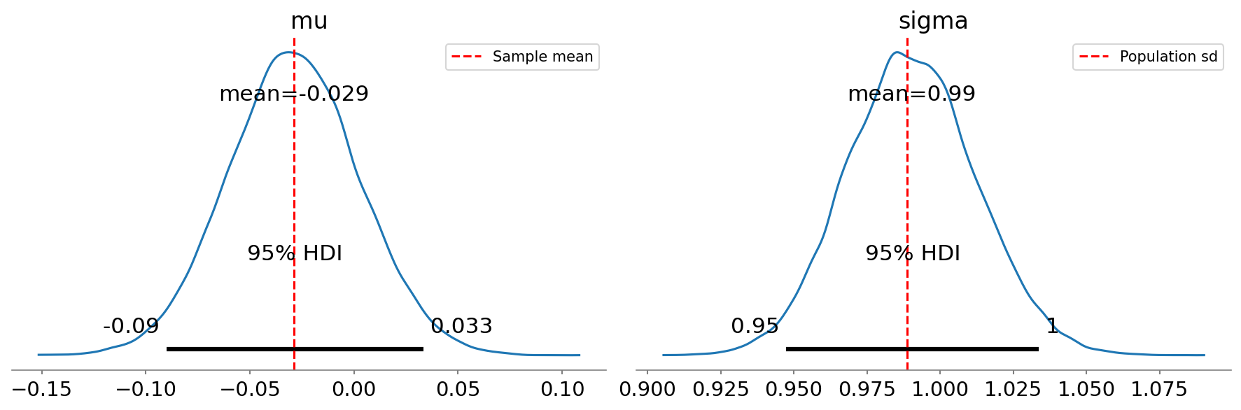
Figure 7:Posterior distributions for mean (mu) and standard deviation (sigma) obtained using Bayesian estimation, with the 95% highest density interval shown by the gray bar at the base of the plot.
Bayesian estimation can be particularly useful when one has a strong prior belief about the value of a parameter and wishes to update that belief based on data. For example, let’s say that there was a published dataset that reported a particular parameter value, and a researcher performs additional observations and wants to update that parameter estimate. Bayesian estimation allows this by the specification of the prior probability distribution. In the example above we used a relatively non-informative prior for the mean (a normal distribution with mean of zero and standard deviation of 1000, which allows for a very wide set of possibilities). However, if we have existing data then we can use those data to inform our subsequent analyses, consistent with the idea that Bayesian inference is a form of learning from data. One can also provide a prior based on one’s scientific hypotheses or expectations, and the ability to incorporate prior knowledge into parameter estimation is generally taken as a strength of Bayesian methods; however, one must be sure that the prior doesn’t overwhelm the data dogmatically, effectively forcing a particular answer regardless of what the data say.
One drawback of Bayesian methods is that they can be very computationally expensive. For example, the Bayesian estimation above took a bit over 2 seconds using 4 parallel sampling processes, which is much slower than the 189 microseconds required for closed-form estimation and also substantially slower than the optimization methods discussed in the next section. There are alternative Bayesian methods known as variational Bayes that use mathematical tricks to speed up estimation, but often require substantial mathematical skill to develop, though some packages like PyMC now offer built-in variational Bayes methods.
Estimating parameters using optimization
In many cases we don’t have a closed form solution that we can use to compute the parameter estimates directly. In this case it’s common to use some form of optimization (or search) process to find the parameters that best fit the data. The simplest way to do this is to try a large range of parameter values and choose the one that best fits the sample, which is known as a grid search. This is generally done with the goal of maximizing the likelihood of the data given the model parameters, and hence is called maximum likelihood estimation. In other words, we aim to find the values of the parameters that make the observed data most likely. In practice we would generally use the log of the likelihood rather than the likelihood itself, since these values are often very small which can result in floating point errors.
In the case of the normal distribution the maximum likelihood estimate is equivalent to the estimate that minimizes the squared error, since the sample variance (which is based on the squared error) is part of the likelihood equation. But we can also use this example to see how grid search might work with our sample. I ran a grid search using a grid of 1000 possible mean values linearly spaced across [-1, 1], and 1000 possible standard deviation values spaced across [0.5, 1.5]; these particular values were based on my knowledge that the data came from a normal distribution and that these ranges should be likely to capture the parameter values in a dataset of this size. The results came out very close to those obtained using the closed-form solution; note that the maximum likelihood estimate for the standard deviation is equivalent to the population rather than sample standard deviation (i.e. it uses rather than in its denominator), so I corrected the sample standard deviation to make the comparison fair:
Best fit mean: 0.0190,   Best fit sd: 0.9785, loglik: -1397.4353
Sample mean:   0.0193, Population sd: 0.9787, loglik: -1397.4352
We can see this visualized in Figure 8, where we see the landscape of the likelihood across a range of possible parameter values; here we use the negative log-likelihood for visualization, since optimization methods tend to use the language of minimization rather than maximization. We can see that this landscape is smooth and only has one visible minimum; this occurs because the negative log-likelihood surface for the normal distribution is convex, which guarantees that there is a single minimum and thus that regardless of where we start our search, we are guaranteed to find the global minimum by simply following the surface downward, a process central to many optimization algorithms (including the commonly used gradient descent). As we will see below, most realistic optimization problems have multiple local minima, making them much more difficult to optimize by simply following the surface downward.
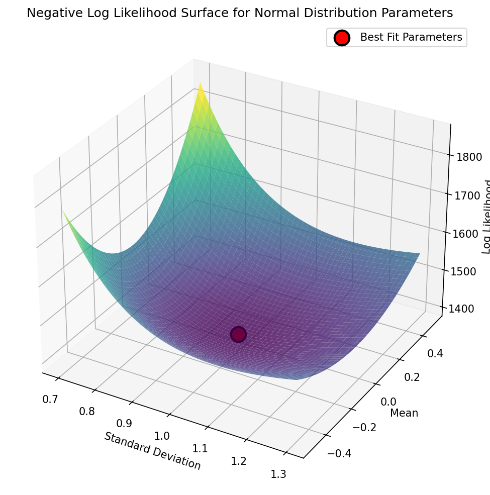
Figure 8:A visualization of the negative log-likelihood landscape for a range of parameter values in the grid search for the mean and standard deviation of a normal distribution.
While grid search worked, it was exceedingly slow, taking more than 25 seconds to estimate the parameters that were estimated by closed form in less than a millisecond - a staggering 89,000 times slower! Grid search is inefficient even with just two parameters, and becomes exponentially less efficient with each additional parameter. A more effective and efficient way to estimate parameters is using optimization methods that are specifically built to search for parameter values that minimize a particular loss function. A common choice in Python is scipy.optimize.minimize(), which offers a number of algorithms for parameter search. We can implement this for our normal distribution data; because the function finds the minimum, we will use the negative log-likelihood as our target, which is equivalent to maximizing the log-likelihood:
import time
from scipy.stats import norm

def negative_log_likelihood(params, data):
    """Negative log likelihood function to minimize"""
    mu, sd = params
    # ensure sd is positive to avoid dividing by zero
    if sd <= 0:
        return np.inf
    return -norm.logpdf(data, loc=mu, scale=sd).sum()

# initial guess
initial_params = [0, 1]

start_time = time.time()
result = minimize(negative_log_likelihood, initial_params, args=(normal_samples,),
                  method='Nelder-Mead')
This gives us a solution that is equal to the fourth decimal place:
Optimized mean: 0.01926,  Optimized sd: 0.97873, loglik: -1397.43520
Sample mean:    0.01933, Population sd: 0.97873, loglik: -1397.43519
These estimates were obtained about 8,000 times more quickly compared to grid search, though still about 10 times slower than the closed-form solution. Note that I had to add some initial guesses for our parameter values, and for this example I used values that were close to the known true values. However, even when the starting values are far from the true values, optimization can often find them quickly and effectively. For example, setting the starting points for both mean and standard deviation to 10,000, the resulting parameter estimates were basically identical, and it still completed more than 2,700 times faster than the grid search.
It’s common to put boundaries on an optimization when there are bounds outside which we are sure that the parameter shouldn’t go. For example, in our example we know that the standard deviation cannot be negative, so we could set the lower bound on the standard deviation parameter to just above zero:
from scipy.optimize import minimize, Bounds

bounds = Bounds(lb=[-np.inf, 1e-6], ub=[np.inf, np.inf])
result = minimize(negative_log_likelihood, initial_params, args=(normal_samples,),
                  method='L-BFGS-B', bounds=bounds)
This doesn’t have much impact on this particular problem, but with complex models and multiple parameters it’s common for parameter values to explode, and setting boundaries can help prevent that. However, as I will discuss below, it’s important to ensure that parameter estimates don’t sit at the boundaries, as this can suggest pathologies in model fitting.
Automated differentiation
The optimization methods discussed above are limited either to small numbers of parameters (like derivative-free methods such as Nelder-Mead) or small numbers of data points (like gradient-based methods such as L-BFGS that require computation of gradients across the entire dataset on each optimization step). Given this, how is it possible to train artificial neural networks that may have billions of parameters over trillions of data points? A key innovation that has enabled effective training of large models is automatic differentiation (often called autodiff for short) combined with gradient descent. Automatic differentiation takes a function definition and (when possible) automatically determines the derivatives of the loss function with respect to the parameters. Gradient descent uses those derivatives to follow the loss landscape downwards. In deep learning it’s most common to use stochastic gradient descent (SGD), which uses small mini-batches of data to iteratively estimate the gradients; even though the estimates for each individual batch are noisy, they are unbiased estimates of the true gradient and computationally cheap to obtain, such that the noise averages out over many iterations to give precise parameter estimates at comparatively low computational cost. However, given the small dataset in this sample we will use the simpler standard gradient descent over the entire dataset at once.
As an example, we can estimate parameters for the Michaelis-Menten equation from biochemistry, which describes the rate at which an enzyme converts its substrate into its product:
where is the reaction velocity, is the concentration of the enzyme’s substrate, is the maximum reaction velocity once the enzyme is saturated with substrate, and is the Michaelis constant that describes the affinity of the particular enzyme for its substrate (defined as the value of at which ). Figure 9 shows a plot of this function for the acetylcholinesterase enzyme, along with noisy data generated from the function.
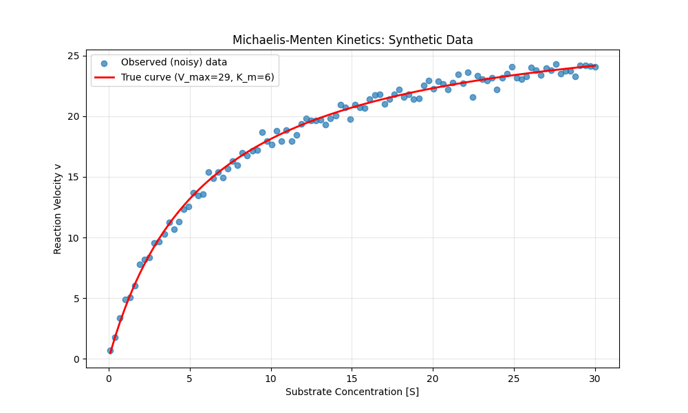
Figure 9:A plot of the Michaelis-Menten function for acetylcholinesterase, along with data sampled from this function with added Gaussian random noise.
This equation could easily be solved using simpler methods, but it’s a nice simple example to show how model parameters can be estimated using autodiff with gradient descent. We can start by defining the Michaelis-Menten function and generating some data with random noise (shown in Figure 9; plotting code omitted):
def michaelis_menten(S, V_max, K_m):
    return (V_max * S) / (K_m + S)

V_max_true = 29  # Maximum velocity (in nM/min)
K_m_true = 6     # Michaelis constant (in mM)
noise_sd = 0.5    # Standard deviation of noise

# Generate substrate concentration data points
S = np.linspace(0.1, 30, 100)

v_true = michaelis_menten(S, V_max_true, K_m_true)
noise = np.random.normal(0, noise_sd, size=v_true.shape)
v_observed = v_true + noise
In order to invoke the automatic differentiation mechanism in PyTorch, we simply need to specify requires_grad=True for the variables that we intend to estimate:
# Convert data to PyTorch tensors
S_tensor = torch.tensor(S, dtype=torch.float32)
v_observed_tensor = torch.tensor(v_observed, dtype=torch.float32)

# specify initial guesses
V_max_init = 10.0
K_m_init = 10.0

# Initialize parameters with random guesses
# requires_grad=True enables automatic differentiation
V_max = torch.tensor(V_max_init, requires_grad=True)
K_m = torch.tensor(K_m_init, requires_grad=True)
We also need to set up a loss function that will define how far the prediction is from the data, for which we will use the squared error:
def compute_loss(V_max, K_m, S, v_observed):
    """Compute MSE loss between predicted and observed velocities."""
    v_predicted = michaelis_menten(S, V_max, K_m)
    loss = torch.mean((v_predicted - v_observed) ** 2)
    return loss
Using this we set up our training loop that uses gradient descent to estimate the parameters (with some code omitted for clarity), and assess the parameter recovery of the model by comparing the estimates to the true values:
# Hyperparameters
learning_rate = 0.1
n_iterations = 500

# Test the loss with initial parameters
initial_loss = compute_loss(V_max, K_m, S_tensor, v_observed_tensor)
print(f"Initial loss: {initial_loss.item():.4f}")

# Gradient descent training Loop
for i in range(n_iterations):
    # Forward pass: compute loss
    loss = compute_loss(V_max, K_m, S_tensor, v_observed_tensor)

    # Backward pass: compute gradients via autodiff
    loss.backward()

    # Update parameters using gradient descent step
    # torch.no_grad() prevents these operations from being tracked
    with torch.no_grad():
        V_max -= learning_rate * V_max.grad
        K_m -= learning_rate * K_m.grad

        # Zero the gradients for the next iteration
        V_max.grad.zero_()
        K_m.grad.zero_()

print(f"\nFinal estimates: V_max = {V_max.item():.4f}, K_m = {K_m.item():.4f}")
print(f"True values:     V_max = {V_max_true:.4f}, K_m = {K_m_true:.4f}")
Initial loss: 188.0915
Final loss: 0.2006
Final estimates: V_max = 29.0894, K_m = 6.1336
True values: V_max = 29.0000, K_m = 6.0000Since there are only two parameters, we can easily visualize how the parameter estimate traverses the loss landscape as the estimation process moves from the initial guesses (in this case 10 for both parameters) to the final values, as shown in Figure 10.
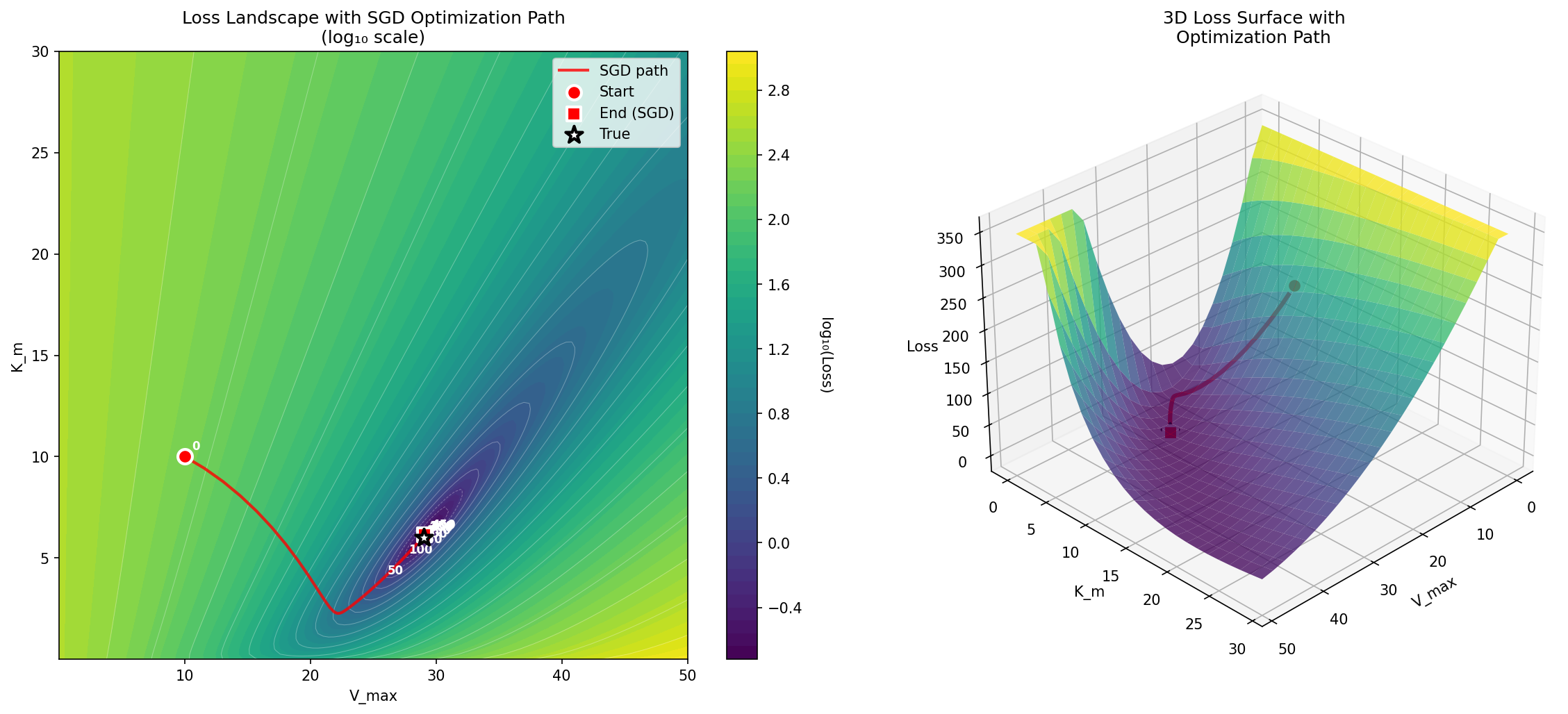
Figure 10:A visualization of the log-loss landscape for the Michaelis-Menten optimization problem, showing the journey of the optimization process from the starting point to the ending point.
Local minima in optimization
The error landscape for the normal distribution example is convex, which means that there is a single global minimum that can be found simply by following the error gradient downwards. Claude Sonnet 4 initially tried to convince me that the Michaelis-Menten problem is convex, but was overruled by Claude Opus 4.5; visit the notebook for this example to see the entire unfolding of this internecene battle. Despite being non-convex, the error landscape of the Michaelis-Menten problem is smooth and relatively well behaved, as seen in Figure 10. However, many realistic scientific problems have highly complex non-convex likelihoods, such that there are numerous local minima that the optimization routine can get stuck in. Figure 11 shows an example of this.
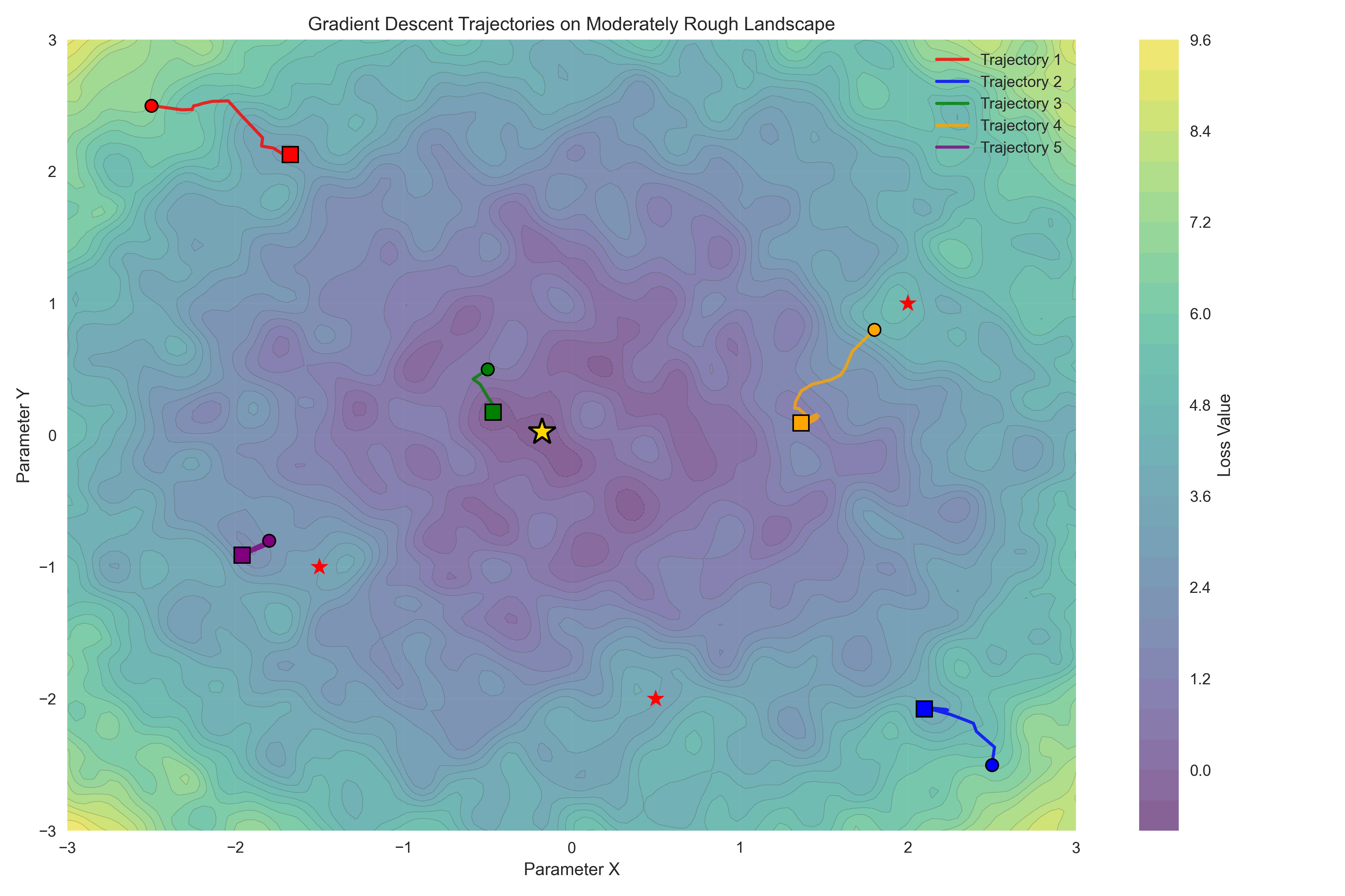
Figure 11:A visualization of a rough loss landscape. The star shows the global minimum, and the individual trajectories show the local minima that are found when using simple gradient descent from different starting points.
There are a number of strategies that one can employ to help avoid parameter estimates that are far from the optimal answer that is located at global loss minimum:
Run the estimation algorithm multiple times with different random initializations of the parameters. If they are similar between runs then this gives confidence that the estimates don’t reflect local minima. If the parameter estimates differ yet losses are similar, this suggests that the parameters may be trading off against one another, which reflects a structural problem with the model or data such that there are many equally good points in the loss landscape. This is often referred to as non-identifiability of the parameters, and is sometimes evident in correlations between the different parameter estimates.
Use an optimizer that adapts the learning rate to the local gradient, such as ADAM or RMSprop.
Use an optimizer that explores more broadly before converging, such as the differential evolution method implemented in
scipy.optimize.differential_evolution.It can sometimes be helpful to reparameterize the model to help with convergence. For example, if the models are physically constrained to being positive, then one might consider optimizing the logarithm of the parameter rather than the natural values of the parameters; this allows the optimizer to explore the entire range of large and small numbers while respecting the positivity constraint. If the different parameters are on very different scales this can also cause problems since the optimizer needs to move at different rates in different directions of the loss space, so reparameterizing the model such that parameters are in roughly the same numeric scale can be useful.
Simulation based inference
Sometimes we want to estimate parameters from a model that doesn’t have a tractable analytic likelihood function (which rules out standard maximum likelihood estimation) and is not differentiable (which rules out gradient-based methods). However, it’s often true in cases like this that it’s relatively easy to simulate data from the model, even if the likelihood can’t be computed. This has led to the idea of simulation-based inference Cranmer et al., 2020, in which one generates synthetic data using a simulation in order to learn how the simulated data relate to the parameters of the model, and then uses that learned mapping to estimate the most likely parameter values (or their full posterior distribution) given the observed data. In many cases it’s not possible to directly compare simulated and observed data (for example, when working with timeseries data that have uncertain phase), so instead one uses some form of summary or embedding of the data that characterizes relevant aspects of its structure in a way that is informative of the model parameters.
As an example, let’s take the stochastic form of Ricker’s [1954] model of population dynamics, which is a state space model that describes how a population size changes over time:
where refers to the (unobservable) true population size at time , refers to the growth rate of the population and describes noisy fluctuations in the population size. Observations of population size are described in terms of a measurement model that is a Poisson-distributed function of the population size:
where is a scale factor. This is a model that is often used to understand how a population will respond to interventions, such as determining how much fishing a fish population can withstand.
The Ricker model does not have a tractable analytic likelihood; more importantly, it also has chaotic dynamics at higher values, such that tiny changes in initial values can have huge impacts on the resulting data. This means that the loss landscape is very jagged and difficult to optimize over. The idea of synthetic likelihood was first developed to analyze these kinds of data, in which one estimates the parameters using summary statistics of the data to estimate parameters rather than the data themselves. If one chooses the appropriate summary statistics then it’s possible to effectively model the data in this way, but this requires a deep understanding of the dynamics of the data; for example, Woods’ [2010] synthetic likelihood implementation of the Ricker model involved the following summary statistics:
the autocovariances to lag 5; the coefficients of the cubic regression of the ordered differences on their observed values; the coefficients, and , of the autoregression where is ‘error’); the mean population; and the number of zeroes observed.
More recently the manual identification of a set of summary statistics has been supplanted by the use of neural network models to generate low-dimensional embeddings of the data. Here I will use a method called Neural Posterior Estimation Greenberg et al., 2019 in which a neural network model is trained to infer the posterior distribution of parameters from simulated data. We also use a separate neural network model to generate a low-dimensional embedding of the observed data, which maintains information about temporal structure of the data and allows comparison of predicted and observed data in a common space.
I will use the sbi Python package that implements several methods for simulation-based inference. We first define our simulator, which for the Ricker model is very simple:
def ricker_model(N, r, sigma=0.3, phi=10):
    N_next = r * N * np.exp(-N + np.random.normal(0, sigma))
    y_next = np.random.poisson(N_next * phi)
    return N_next, y_next

def ricker_simulator(params: torch.Tensor, t=None, n_time_steps=250, starting_n=100):
    r = params[0].cpu().numpy()  # intrinsic growth rate
    sigma = params[1].cpu().numpy()  # growth rate variability
    phi = params[2].cpu().numpy()      # measurement error term

    if t is None:
        t = torch.linspace(0, 1, n_time_steps)

    N = starting_n
    timeseries = []
    for t in range(n_time_steps):
        N, y = ricker_model(N, r, sigma, phi)
        timeseries.append(y)
    # return only y values
    return torch.as_tensor(np.array(timeseries), dtype=torch.float32)
In this case the model generates the next latent population size as well as the next observation based our Poisson-distributed measurement model (here using the global random number generator for simplicity), and the simulator function runs this model over a number of time steps. We next specify the prior distributions for our parameters of interest (using uniform priors over a large range of possible values), and generate a large number of datasets using samples from these priors:
from sbi.utils import BoxUniform
import torch

# use the GPU if it's available
device = torch.device("cuda" if torch.cuda.is_available() else "cpu")

# Define prior distributions based on parameter ranges
# r (intrinsic growth rate): [1, 100]
# sigma (growth rate variability): [0.1, 5]
# phi (measurement error term): [1, 50]
prior = BoxUniform(
    low=torch.tensor([1, 0.1, 1], device=device),
    high=torch.tensor([100, 5, 50], device=device),
    device=device
)

# Generate training data
n_simulations = 1000000
thetas = prior.sample((n_simulations,))
xs = torch.stack([ricker_simulator(theta) for theta in thetas]).to(device)
Note the references to device in the calls to Pytorch objects; the device variable refers to the computational device that will be used for model fitting, which in this case will use the GPU (referred to as “cuda”) if it is available, or the CPU otherwise. As we will discuss in the chapter on performance optimization, when available GPU acceleration can greatly reduce the time needed to fit neural network models.
We then need a way to embed the data in a way that captures the relevant temporal structure in the data. For this we will use a causal convolutional neural network, which embeds our timeseries (which in this example is 250 observations) into a 20-dimensional space that attempts to capture the short-range temporal regularities in the data. This is then used to create a density estimator using a method called masked autoregressive flows (or “maf”):
from sbi.neural_nets import embedding_nets, posterior_nn

# Define a causal CNN embedding for 1D time-series data
embedding_cnn = embedding_nets.CausalCNNEmbedding(
    input_shape=(250,),      # Time series length
    num_conv_layers=4,       # Number of convolutional layers
    pool_kernel_size=8,      # Pooling window for temporal downsampling
    output_dim=20,           # Embedding dimension
).to(device)

density_estimator = posterior_nn(
    model="maf",
    embedding_net=embedding_cnn,
    z_score_x="none",
    z_score_y="none",
)
This density estimator is then used to train a neural network to generate posterior estimates based on the simulated observations (from known parameter values) after embedding them:
from sbi.inference import NPE

inference = NPE(prior=prior, density_estimator=density_estimator, device=device)
inference = inference.append_simulations(thetas, xs)
posterior = inference.train(training_batch_size=50, max_num_epochs=100)
Once we have the model, then we can sample from it in order to generate a posterior distribution across the parameters for our observed dataset (which is actually a simulated dataset with known parameters):
n_samples = 50000
posterior_conditioned = inference.build_posterior(posterior)
posterior_samples = posterior_conditioned.sample((n_samples,), x=x_obs)
Note that since posterior sampling is computationally cheap, we can easily obtain a large number of samples, which helps give cleaner posterior distributions. We can then compare the posterior samples to the true parameter values; as shown in Figure 12, the posterior distributions capture each of the true parameter estimates fairly well. One common way to summarize the posterior sample is the maximum a posteriori (MAP) estimate, which is the parameter value with the maximum density. We can also give a 95% credible interval using the posterior distribution, which is the range in which there is 95% probability that the true value falls. In this case these intervals are quite wide, suggesting that our estimates are not particularly precise.
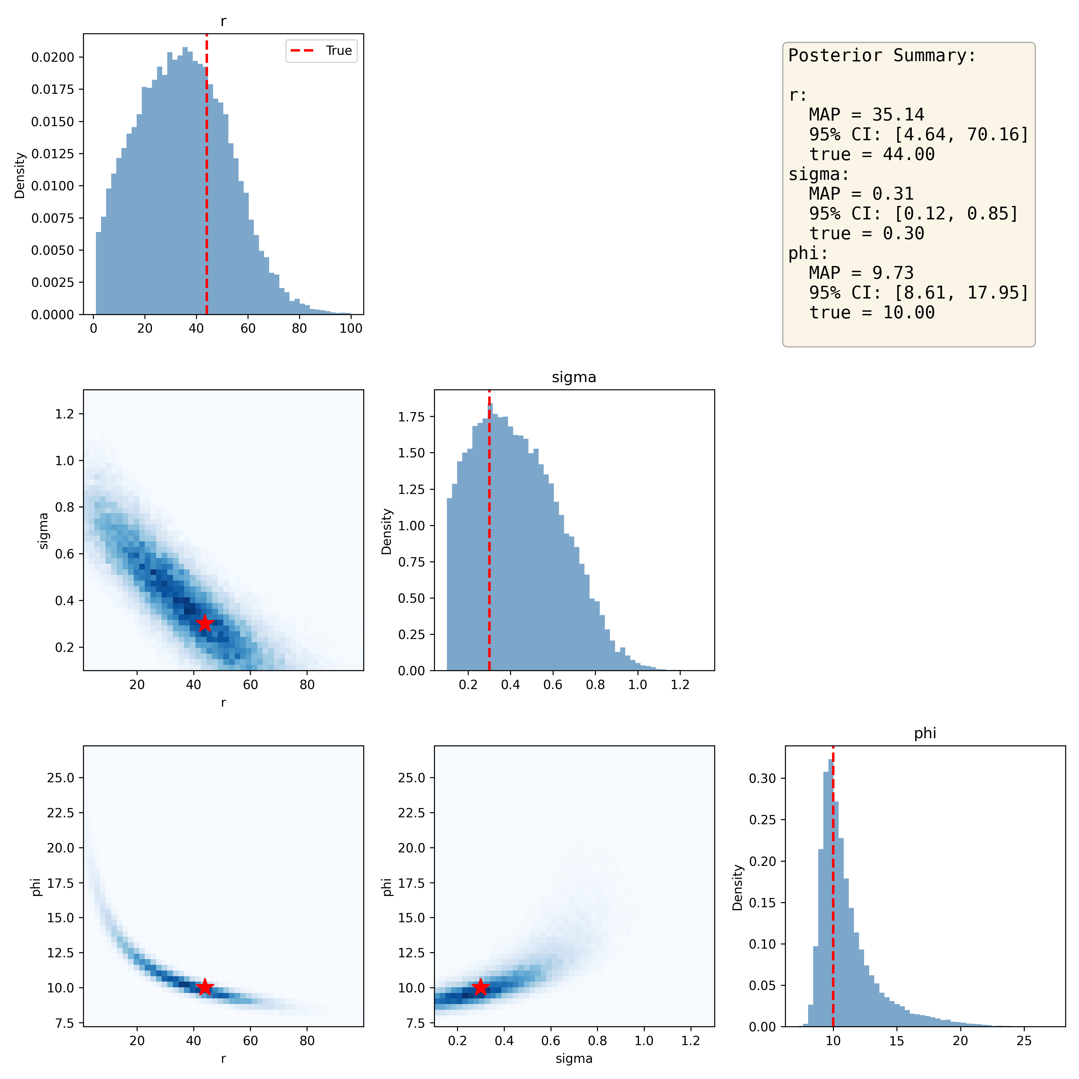
Figure 12:Joint distribution plots for the sampled posterior distributions of Ricker model parameters, with the true values denoted by the red star in the joint plots. The posterior summary presents the maximum a posteriori (MAP) estimate for each parameter along with the 95% credible interval based on the posterior distribution.
Parameter recovery
Simulation allows us to assess how well our estimation procedure performs, by generating data with known model parameters and then comparing the estimated parameters to the true values. Using the code that I had developed for the earlier example, I generated a simulation harness that ran a large number of simulations and recorded the results; the full code is here. I started by training the posterior estimator using one million simulations, in order to ensure that it had good training across the range of possible parameters; Given that this just needs to be trained once, I saved it for later use in my simulations. Then I performed 10,000 experiments in which I generated a dataset from the Ricker model based on known parameters along with added noise, and then used the posterior estimator to estimate the parameters for the dataset.
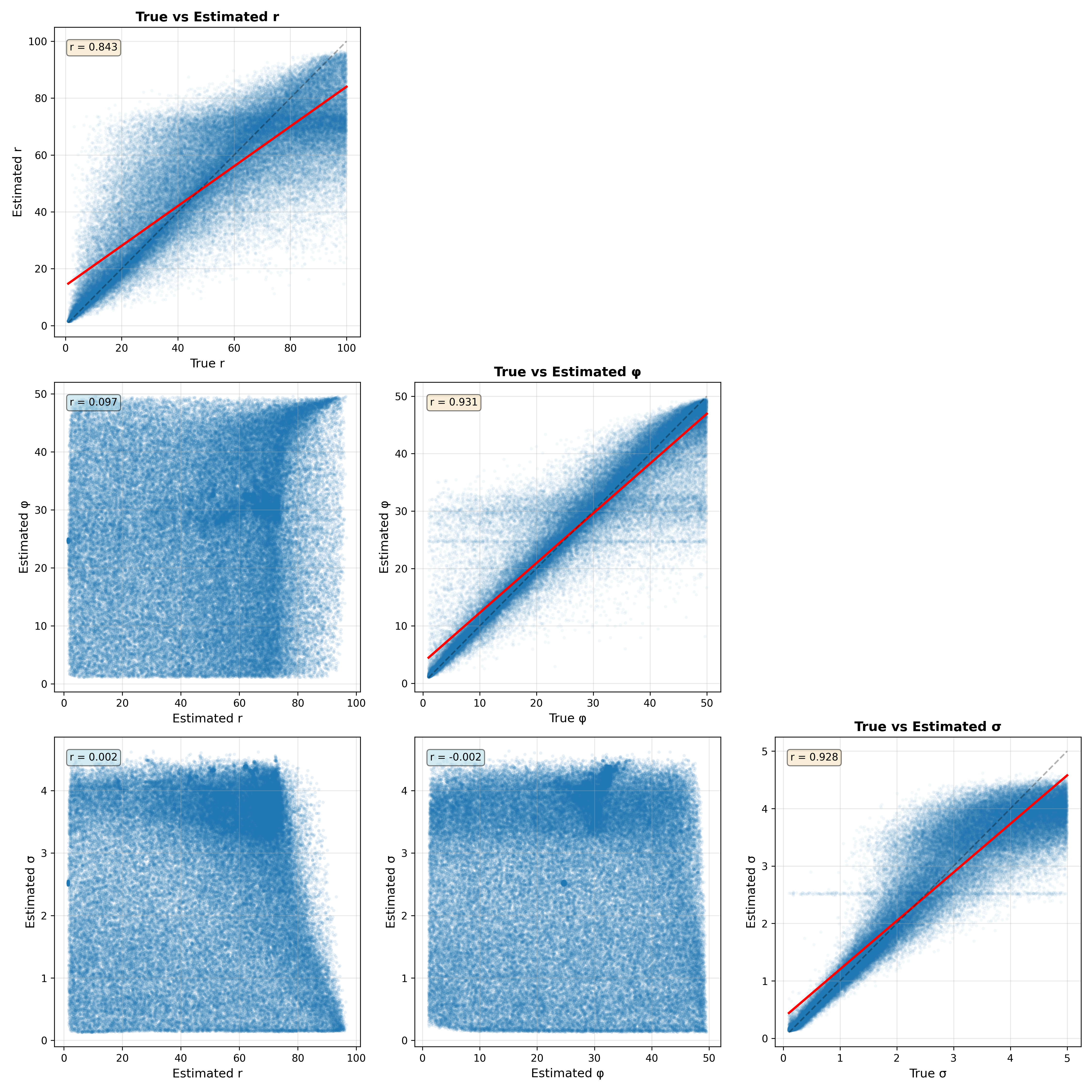
Figure 13:Parameter recovery analysis for 10,000 datasets generated from the Ricker model. The plots along the diagonal show the relationship between the true and estimated values and their correlation. The plots in the lower triangle show the relationship between parameter estimates for each pair of parameters.
Figure 13 shows the relationship between the true and estimated parameters on the diagonal. We see that the correlations between true and estimated parameters are reasonable but that in some rare cases the estimates can veer far from the true values. There is also faint evidence of some pathologies in model fitting. For both the phi and sigma parameters, there are bands of data points that suggest that the parameter estimation is being pulled towards the prior mean, which can occur if the data are not sufficiently informative. The off-diagonal plots show the relationship between the estimated parameters for each pair of parameters. This is useful to visualize because correlations between estimated parameters can reflect a lack of model identifiability, in which parameters trade off against one another. In this case these relationships are very weak, suggesting that the model parameters are indeed identifiable.
Statistical calibration using randomization
The use of null hypothesis statistical testing is ubiquitous across the sciences, despite having been lambasted for years as “mindless” and “wrongheaded”, as I outlined in my Statistical Thinking. Despite its problems, it remains a central tool for researchers. The most common statistical tests are parametric tests, which means that they are based on distributional assumptions about the statistic in question under the null hypothesis (which usually refers to the lack of an effect). For example, a t-test for differences between two groups would compare the magnitude of the statistic to a distribution with a mean of zero and with degrees of freedom related to the sample sizes. The resulting p-value tells us how likely the observed data would be if the null hypothesis were actually true. For example, let’s say that we want to look at the correlation between deliberative decision making (i.e. Kahneman’s “Thinking Slow”) measured using the Cognitive Reflection Test, and self-reported household income in the Eisenberg et al. dataset. The correlation between these variables measured using the Spearman rank correlation coefficient is 0.16, and the resulting p-value compared to the null hypothesis of zero is 0.0002, meaning that we would very rarely expect to see a correlation of this size in a sample of this size if there were truly no correlation.
While there is a parametric method to compute a p-value for some tests, in many cases we don’t have a distribution to compare to under the null hypothesis. In this case, a standard approach is known as randomization testing (or sometimes permutation testing), in which we generate new synthetic datasets by randomizing our actual data in a way that causes the null hypothesis to be true. In our correlation example above, we could repeatedly resample one of the variables with random shuffling, thus breaking the link between the two variables; we are in essence forcing the null hypothesis to be true. By doing this repeatedly we can create a null distribution for the statistic of interest, and then compare the observed value to the distribution to determine how likely it would be under the null hypothesis:
from scipy.stats import spearmanr

n_permutations = 10000
observed_corr, _ = spearmanr(data[col1], data[col2])
# include observed corr to ensure that p is not zero
permuted_corrs = [observed_corr]
for _ in range(n_permutations):
    shuffled_col2 = data[col2].sample(frac=1, replace=False).values
    permuted_corr, _ = spearmanr(data[col1], shuffled_col2)
    permuted_corrs.append(permuted_corr)

p_value_randomization = np.mean(np.abs(permuted_corrs) >= np.abs(observed_corr))
print(f"Randomization p-value = {p_value_randomization:.5f}")
Randomization p-value = 0.00040Here we see that the p-value obtained through randomization is very close to the one obtained using the parametric test. The benefit of randomization is that it can be used for any statistic, regardless of whether it has a theoretical null distribution or not. However, note that randomization does generally require the assumption of exchangeability, which can fail when the observations are not independent.
Computational control experiments
When we build a computational model or analytic tool, it is essential to ensure that it performs properly. One way to do this is to perform control experiments in which we inject a particular kind of data and make sure that the tool returns the expected results; in a sense this is another form of parameter recovery. There are two types of control experiments that one can run: negative controls and positive controls.
Negative controls
A negative control is a test that should reliably produce negative results. Thinking back to the discussion of COVID-19 home tests in the earlier chapter on software testing, a negative control would be one where we run a sample know to be COVID-free; if the test line appears then the test is invalid. When we build a software tool that is meant to detect a signal, it is essential that we ensure that it will reliably return a negative result when there is no signal.
Negative controls are particularly important whenever one is developing a new method that should have a particular error rate. As an example, let’s say we wanted to use the RNA-seq dataset from the previous chapter to develop a new biomarker for biological aging. We could select data from a set of 16 older individuals (over 70) and 16 younger individuals (under 40) and then fit a classification model using a stochastic gradient descent classifier. We could quantify out-of-sample predictive performance using cross-validation, where different subsets of the data are used to fit the model and the remainder of the data is then used to test the model for that subset. The results (shown in more detail [here]) show that we are able to predict whether a person was younger or older with about 67% accuracy; in this case, because the two groups were the same size, we would expect 50% accuracy by chance, and this seems much higher than chance. However, it is always important to ensure that the model performs as expected when there is no signal to be found, and in many cases like this one we can use randomization to break the relationship between variables and ensure that performance should be at chance on average.
You might ask how the performance of the model could possibly not be at chance when the data labels are randomized. Unfortunately, the phenomenon of leakage, in which information from the test data leaks into the training procedure, is exceedingly common, and it can sometimes result in highly inflated predictive results even when there is no true signal Kapoor & Narayanan, 2023. This inflation is particularly powerful when sample sizes are small, like our example with only 16 data points per group.
The most common way in which leakage occurs is when features (i.e. variables) are initially selected based on their relationship to the outcome variable across the entire dataset, rather than being selected using only the training data within each cross-validation fold. We can assess the impact of this by repeatedly resampling the data while randomly shuffling the outcome variables, just ensuring no true predictive ability. Indeed, in this example if we do feature selection appropriately (inside the crossvalidation loop) then the average classification accuracy for randomly shuffled samples is 0.498, which does not significantly differ from the theoretical value of 0.5. However, if we do feature selection prior to cross-validation, then we see average accuracy of 0.614, which is well above the theoretical value. Thus, negative control testing using randomization can help identify cases where results are inflated due to improper analytic procedures.
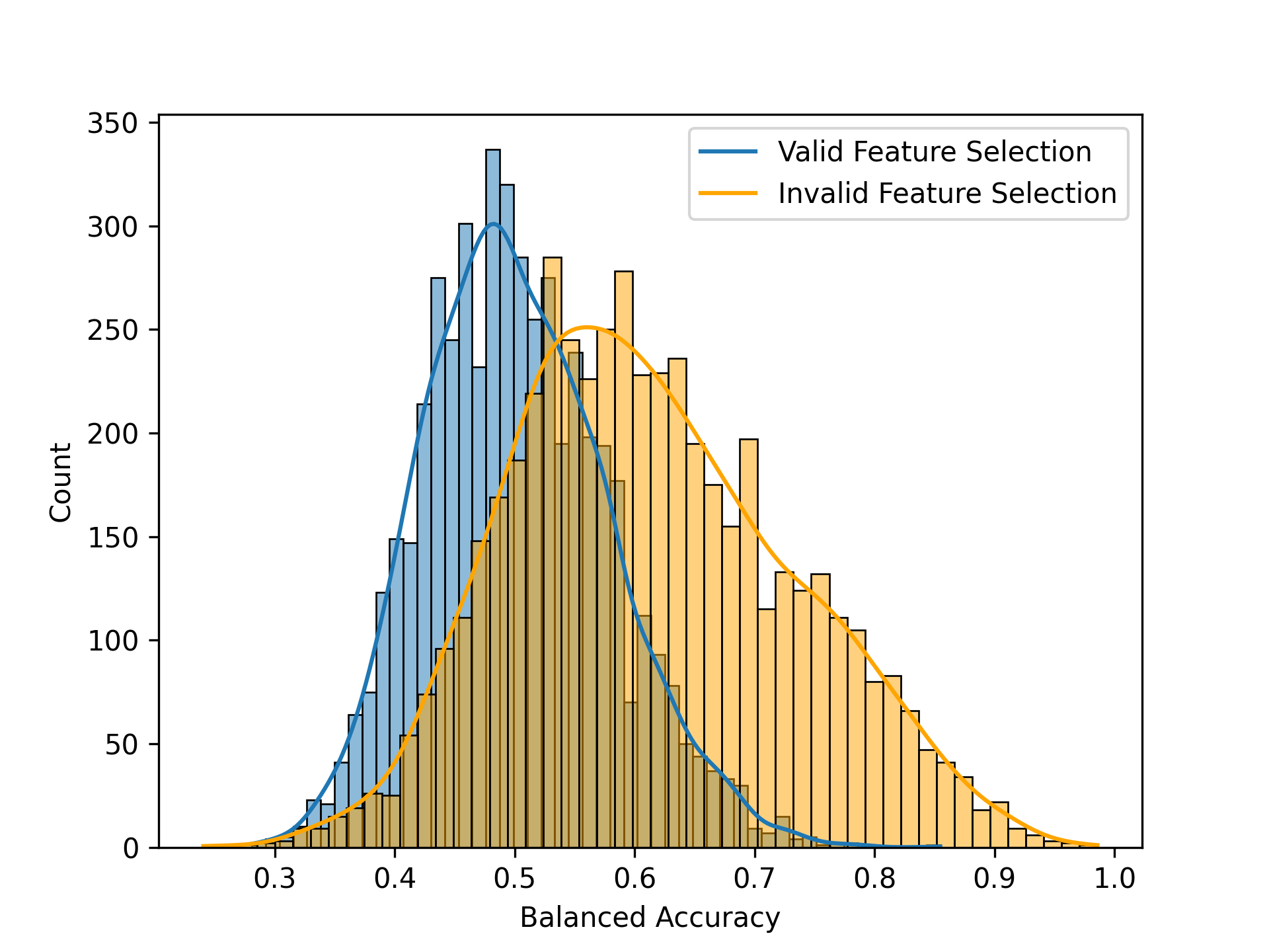
Figure 14:A comparison of the null distributions with proper feature selection (blue) and improper feature selection (red).
Positive controls
When developing analytic software, it is also important to determine whether the model can detect relevant signals when they are present, which we refer to as a positive control. This is like the control bar on the home COVID test that confirms that the test is working properly. To do this, we would generally need to inject some amount of realistic signal into the data, and then assess the model’s ability to detect it. While useful for checking code, positive control simulations are also useful for understanding how various features of the study design (such as the sample size and the intended effect size) relate to the ability to detect signals; in the context of null hypothesis statistical testing this is often known as statistical power.
Let’s say that we wanted to build a model to detect a particular disease from gene expression data, and we want to ensure that our model can detect a realistic effect. As an example of this I built a simulation using the RNA-seq data from above. I created a random outcome variable denoting disease presence (with a 10% prevalence), and then multiplied the values of a subset of features by a weighting factor based on disease presence so that expression levels of these genes would be associated with the disease. I initially wrote a function to perform a single simulation, but it was unwieldy so I had Claude refactor it into a well-structured class with a separate dataclass for configuration variables. Here is the config dataclass:
@dataclass
class SignalInjectionConfig:
    """Configuration for signal injection experiments."""
    nfeatures_to_select: int = 1000
    sim_features: int = 10
    n_splits: int = 10
    disease_prevalence: float = 0.1
    noise_sd: float = 1.0
    test_size: float = 0.3
    scale_X: bool = True
    shuffle_y: bool = False
The main class then implements each of the main components of the function as a separate method. Inspecting the code closely, I found a place where the AI agent misinterpreted the logic of the original code:
        # Shuffle or inject signal
        if self.config.shuffle_y:
            y = self.rng.permutation(y)
        elif beta is not None:
            y = self._inject_signal(X, y, beta)
In principle the signal injection is independent of whether or not y is shuffled, since the _inject_signal() method generates a new synthetic y variable. However, if one happened to setting shuffle_y=True then the signal injection would be skipped by this code, which is not the intention. To fix this I reordered the statement:
        if beta is not None:
            y = self._inject_signal(X, y, beta)
        elif self.config.shuffle_y:
            y = self.rng.permutation(y)
Here is the run() method that shows the execution of the main crossvalidation loop, with the different components split into class methods, which makes the code much more readable and understandable:
    def run(
        self,
        X: np.ndarray,
        y: np.ndarray,
        beta: Optional[float] = None
    ) -> dict:
        """
        Run cross-validated classification with optional signal injection.

        Parameters
        ----------
        X : np.ndarray
            Feature matrix
        y : np.ndarray
            Target labels
        beta : float, optional
            If provided, inject synthetic signal with this coefficient

        Returns
        -------
        dict
            Mean scores across all CV folds
        """
        # Convert to numpy arrays
        X = np.array(X)
        y = np.array(y)

        # Shuffle or inject signal
        if beta is not None:
            y = self._inject_signal(X, y, beta)
        elif self.config.shuffle_y:
            y = self.rng.permutation(y)


        # Collect results across folds
        fold_results = {
            'test_scores': [],
            'train_scores': [],
            'nfeatures': []
        }

        for train_idx, test_idx in self.cv.split(X, y):
            X_train, X_test = X[train_idx], X[test_idx]
            y_train, y_test = y[train_idx], y[test_idx]

            # Scale features
            if self.config.scale_X:
                X_train, X_test = self._scale_features(X_train, X_test)

            # Select features
            if self.config.nfeatures_to_select is not None:
                X_train, X_test = self._select_features(X_train, y_train, X_test)

            # Evaluate fold
            fold_scores = self._evaluate_fold(X_train, X_test, y_train, y_test)

            # Store results
            scorer_name = self.scorer.__name__.replace('_score', '')
            fold_results['test_scores'].append(fold_scores[f'test_{scorer_name}'])
            fold_results['train_scores'].append(fold_scores[f'train_{scorer_name}'])
            fold_results['nfeatures'].append(fold_scores['nfeatures'])

        # Compute mean scores
        scorer_name = self.scorer.__name__.replace('_score', '')
        return {
            f'test_{scorer_name}': np.mean(fold_results['test_scores']),
            f'train_{scorer_name}': np.mean(fold_results['train_scores']),
            'nfeatures_selected': np.mean(fold_results['nfeatures'])
        }
Finally, it created a wrapper function that replicates the interface of the previous function, so that I don’t have to change the calls to that older function:
def run_signal_injection(X, y, beta=None, model=None, cv=None, shuffle_y=False,
                    scorer=None, rng=None, scale_X=True,
                    nfeatures_to_select=1000, sim_features=10,
                    n_splits=10, disease_prevalence=0.1, noise_sd=1.0):
    """
    Run a classifier with cross-validation, optionally injecting synthetic signals.

    This is a compatibility wrapper around SignalInjectionClassifier.
    For new code, prefer using the class directly.
    """
    config = SignalInjectionConfig(
        nfeatures_to_select=nfeatures_to_select,
        sim_features=sim_features,
        n_splits=n_splits,
        disease_prevalence=disease_prevalence,
        noise_sd=noise_sd,
        scale_X=scale_X,
        shuffle_y=shuffle_y
    )

    classifier = SignalInjectionClassifier(
        config=config,
        model=model,
        scorer=scorer,
        rng=rng
    )

    return classifier.run(X, y, beta=beta)
I ran two sets of simulations using this code (shown in Figure 15), examining how classification accuracy relates to the magnitude of the injected signal as either the number of features or sample size was varied. These results showed that the model behaved as expected, and also provided some insight into the limitations that smaller samples sizes would place on the ability to accurately classify. The experience in refactoring above also once again highlights the need to closely check AI-generated code, as coding agents can often make subtle mistakes, especially when logic of the original code is not clear (as was the case here).
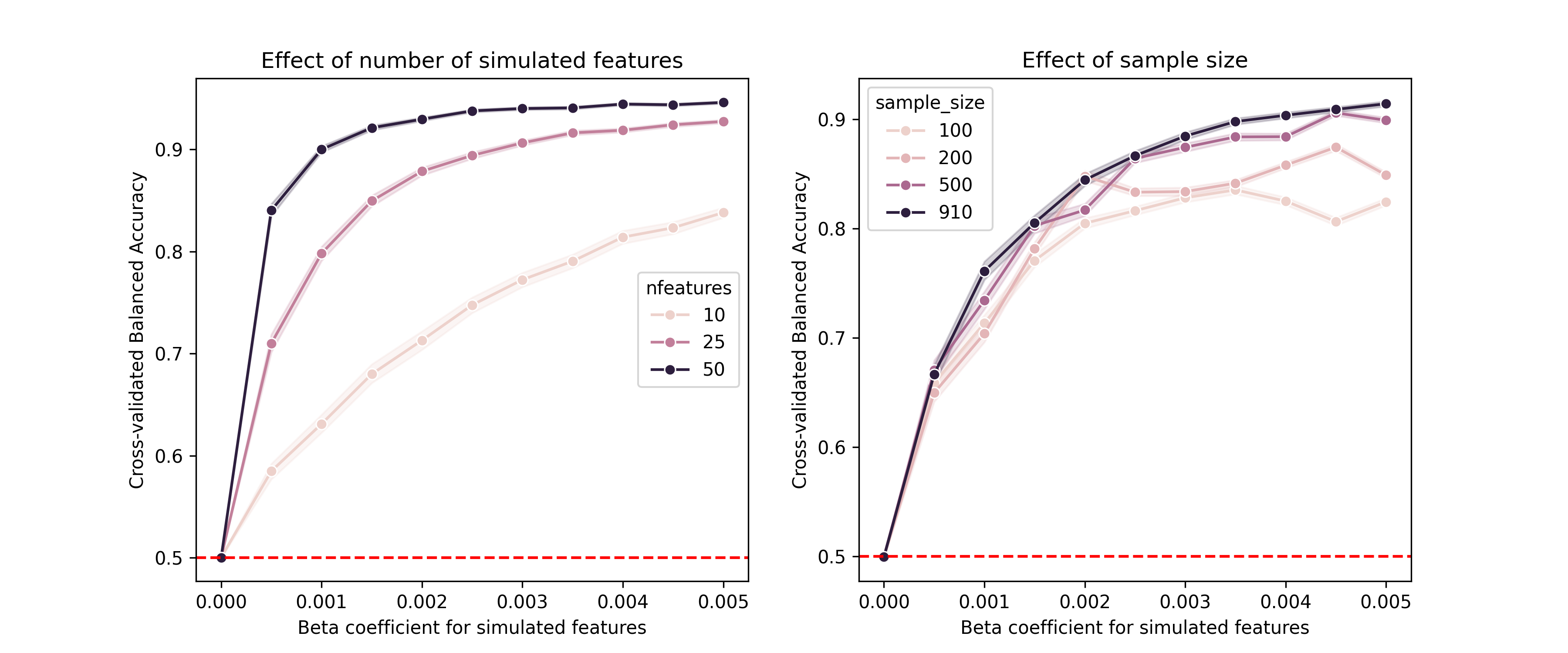
Figure 15:Results from simulations of classification performance using injected signals over different levels of simulated signal. Left panel shows effect of varying number of simulated features, and right panel shows effect of varying sample size.
Sensitivity analysis
It’s rarely the case that there is a single analysis workflow that is uniquely appropriate for any particular scientific problem. Different methods come with different assumptions and often embody tradeoffs between different factors:
Bias-variance tradeoffs: While unbiasedness is widely thought to be an important feature of a statistical estimate, we are often willing to trade a small amount of bias in exchange for a significant reduction in the variance of our estimates. The most common example of this is the use of regularized methods that penalize model complexity; for example, regularized regression methods like ridge regression penalize the magnitude of model parameters and thus bias model parameters towards zero in exchange for potentially increased predictive performance.
Penalization tradeoffs: If one uses regularized models then there are tradeoffs in the selection of methods for model fitting (such as L1- versus L2-based penalizations, which vary in the sparseness of their model parameters). Similarly, model comparison methods (such as the use of Akaike Information Criterion (AIC) versus Bayesian Information Criterion (BIC) in model selection) differ in the degree to which they include sample size in the penalty.
Statistical assumptions: Many statistical techniques make assumptions about the distribution of the model residuals or independence of samples.
Sensitivity/specificity tradeoffs: Depending on the application we may worry more about false positives (e.g. disease diagnosis where the treatment is very risky) or false negatives (disease diagnosis where early treatment is the key to survival), and thus we may want to prioritize sensitivity or specificity.
Preprocessing tradeoffs: Preprocessing operations such as smoothing can have important impacts on the data, improving sensitivity to larger features but reducing sensitivity to features smaller than the smoothing operator.
Interpretability tradeoffs: Simple models (such as regularized regression models or decision trees) can be easily interpreted based on the parameter values, but they may not perform as well as more complex models (such as deep neural networks) that can be much more difficult to interpret.
Robustness tradeoffs: In some cases we may want to trade off some degree of sensitivity in favor of robustness. For example, parametric statistical methods are generally more efficient than nonparametric methods when their assumptions are fulfilled, but nonparametric methods provide robustness to failed assumptions at a slight cost of efficiency.
In each of these there is no answer that is universally right: the choices for any application will depend upon the goals of the researcher and the specifics of the data themselves. The goal of sensitivity analysis is to broadly test the range of reasonable/plausible analyses and assess the degree to which the outcomes change in relation to specific analytic choices.
Previous work has shown that real-world analytic variability can have major impact on the results. We Botvinik-Nezer et al., 2020 examined this in a study that collected a neuroimaging dataset and distributed it to a large number of research teams, asking them to test a set of hypotheses using their standard methods. The results from 70 teams showed a substantial degree of variability; for 5 of the 9 hypotheses tested, the proportion of teams reporting a positive result ranged from 20-40%. The realization of the impact of analytic variability has led to the use of multiverse analysis strategies, in which multiple analytic choices are compared and their impact on the results is assessed.
An example of multiverse analysis
Here I will use an open ecology dataset to ask a simple question: How do bill depth and bill length covary in penguins? This might seem like an obvious question, but it’s actually an example where multiverse analysis can provide useful insight. Gorman and colleagues Gorman et al., 2014 collected data over three years that included measurements of bill length and depth and body mass from a total of 333 Antarctic penguins, and openly shared those data. The dataset includes three different species of penguins (Adelie, Gentoo, and Chinstrap), each of which inhabits a different ecological niche and has different body characteristics. For this multiverse analysis I focused on two features of the model (code here). First, I varied the way that species is included in the model, either leaving it out of the model, or modeling it using a mixed-effect linear model with either a random intercept or random slope and intercept across species. Second, I varied the inclusion of a number of possible covariates of interest: sex, year of data collection, island where the data were collected, and overall body mass.
One of the challenges of multiverse modeling is organizing all of the different models to be tested, which in this case comprises a set of 48 models. I generated a class that specified all of the model features, and included a method that fits the specified model and returns the results as a dictionary. I then iterated over each modeling approach with all possible combinations of covariates, fitting each of the 48 models, which took about one second to run on my laptop. One common challenge with mixed effects models is that more complex models (like random-slope models) can fail to converge when they are fitted (since they use maximum likelihood estimation and thus must be estimated using optimization), and I saw this initially when I fit the random-slope models using the default optimizer. Because the resulting parameter estimates are not trustable when the model fails to converge, I added code that tried several different optimizers when convergence failed; this resulted in convergence for all of the models.
Once we have fitted all of the models then we need to summarize the results, and a common way to do this is a specification curve plot. Figure 16 shows an example of such a plot for the penguin analysis. Strikingly, we see in the top panel that while most of the models show significantly positive coefficients, a subset of models show significantly negative coefficients! The lower panel shows the features of each of the models, which helps understand the cause of the difference in model parameters: The negative parameters occurred only in models where species was not included in the model.
Figure 16:A specification curve plot for the penguin analysis. The top panel shows the sorted estimated effect sizes for the bill length model parameter across all of the models; statistically significant effects are colored in green. The lower panel shows the features of each model using tick marks.
Figure 17 provides further insight into why this occurred. The left panel shows that across all penguins there was a negative relationship between bill length and depth. However, the right panel shows that within each species there was a positive relationship between these features; in the models that included a random effect of species, the overall differences between species were removed and the positive effect could be observed. This is an example of Simpson’s paradox, in which the pattern observed across a dataset is inconsistent with the pattern observed within subgroups of the dataset. This is usually due to the presence of a confounding variable, which in this case is species. This example shows how multiverse analysis can help bring out important features in the data and better understand the robustness of results across modeling choices.
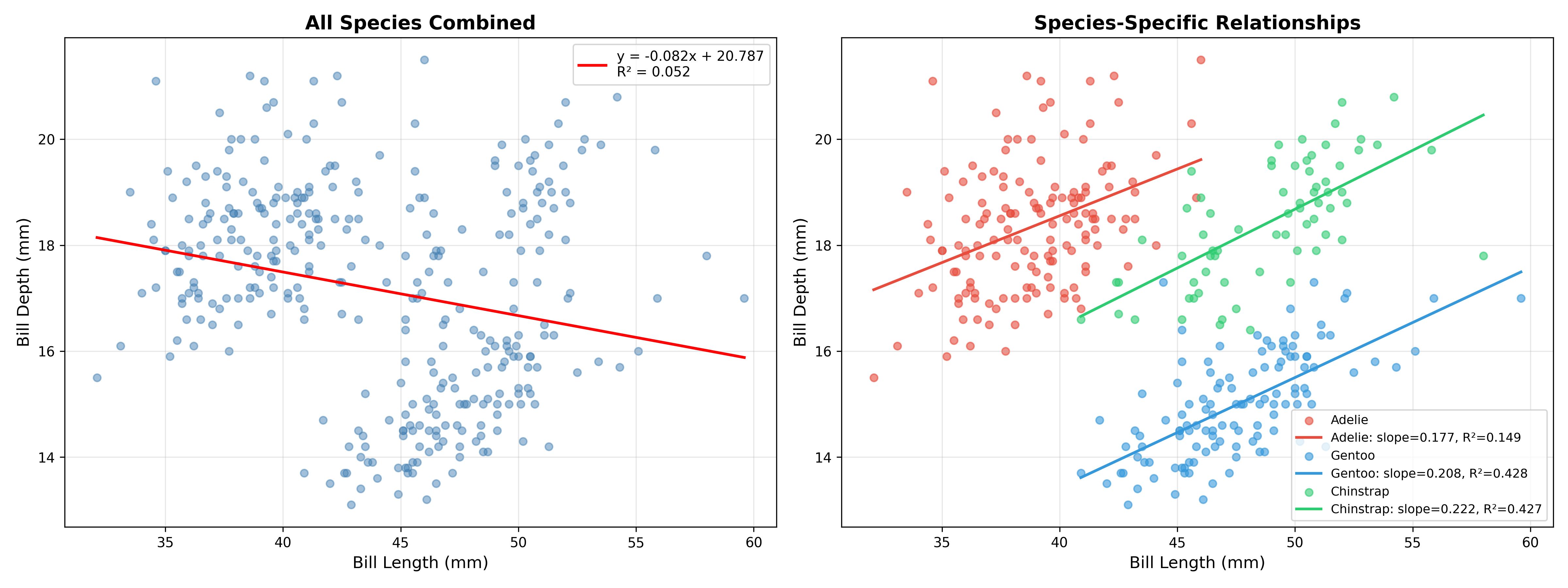
Figure 17:Plots showing the regression of bill length against depth in the penguin dataset. The left panel shows the regression computed on the entire dataset combined across all species. The right panel shows separate regressions for each species.
Sensitivity to random seeds
When using analysis methods that involve random numbers, it is essential to establish that the results are robust to different random seeds, and also to determine the degree of variability across simulations due to random seed variability. There is published evidence Ferrari Dacrema et al., 2021 that some authors may cherry-pick results across random seeds in order to obtain better results, which we sometimes refer to as seed-hacking on analogy to p-hacking.
As an example (code here), I generated 50 synthetic datasets for a classification problem, and assessed the performance of two different classifiers that involve random numbers: a simple neural network model (Perceptron), and a stochastic gradient descent classifier [2]. Each classifier was applied to the each dataset using 1000 different random seeds and their accuracy was recorded. The result (shown in Figure 18) was striking: although the average performance of the two models differed minimally across the 50,000 simulations (0.7276 for SGD versus 0.7280 for Perceptron), depending on the specific random seed one could find cases where each of the classifiers outperformed the other by almost 10%! This highlights the importance of quantifying the degree of variability due to random seed choice.
Figure 18:A demonstration of variability in classification model accuracy due to different random seeds. Each violin represents the distribution of performance across 1000 random seeds for a single dataset.
Sensitivity to modeling assumptions
Statistical models often make assumptions that, if violated, can invalidate any performance guarantees that come with the model. Here we will look at the commonly violated assumption of independence. While assumptions regarding normality of errors are often discussed by researchers, most methods are remarkably robust to violations of normality as long as the sample size is large enough.
Many statistical methods rely upon an assumption that the residuals from the model are independent and identically distributed (or IID). This assumption can easily be violated when the data has structure that involves relationships between observations, such as time-series data, spatial data, clustered data (e.g. data from families), or repeated measures on individuals. When this assumption is violated, the actual error rate of the method can sometimes far exceed the reported error rates computed under the IID assumption (although the parameter estimates should remain unbiased as long as the other assumptions of the model are fulfilled).
Clustered data
A common cause of failures of independence is the presence of group structure in the data, which can lead to clustered errors; that is, members of each group are more similar in their errors compared to those in other groups. Figure 19 shows how clustering in the data can lead to highly inflated error rates, particularly when there is a small number of clusters. This occurs because clustering leads to underestimation of the standard error that is used to compute the test statistic. There are several different ways that the impact of clustered errors can be corrected, which are differently used across different research domains McNeish et al., 2017. These include:
Cluster-robust estimators for the standard error (commonly used in biostatistics)
Fixed effect models (commonly used in economics and social sciences)
Mixed effect models (commonly used in psychology and social sciences)
Figure 19 shows that each of these does a good job of correcting for the effects of clustering in the data. The Python implementation of mixed effects modeling shows slightly inflated error rates, due to the fact that it uses a z-statistic which has slightly inflated error rates for small numbers of clusters, whereas the R implementation uses a correction to the degrees of freedom that corrects this.
Figure 19:An example of the effects of clustering on statistical outcomes. Data were generated with a single intercept for the non-clustered group and with randomly varying intercepts across groups for the clustered group. Full code available here.
Autocorrelated data
Even more striking failures to control error can occur when the data are autocorrelated, meaning that adjacent data points in the dataset are correlated, as occurs commonly in timeseries or spatial data. Autocorrelation can severely inflate error rates and render the estimates inefficient, though they generally remain unbiased; one particular case when they can become biased is when the the error terms are correlated with the true explanatory variables, which is referred to as endogeneity and is common when important explanatory variables are excluded from the model e.g. Antonakis et al., 2014. Figure 20 shows error rates in simulated data with increasing degrees of autocorrelation. The ordinary least squares (OLS) regression model performs very badly here, with false positive rates approaching 70% when autocorrelation reaches 0.9. The results of a number of other methods that are commonly suggested for addressing autocorrelation are also shown in the figure; while these do perform much better than vanilla OLS, none of them appropriately controls error rates as autocorrelation becomes very high. This is a great example of how one can’t simply take the suggestions of a coding agent (or the Internet) and run with them without checking that they adequately control error rates.
Figure 20:An example of the effects of autocorrelation on statistical outcomes. Data were generated with no true signal in the model and with increasing levels of autocorrelation in the noise. In addition to the improper ordinary least squares (OLS) approach, a number of different approaches were applied that are meant to correct for the effects of autocorrelation: generalized least squares (GLS) using an AR(1) covariance, HAC (Heteroskedasticity and Autocorrelation Consistent) standard errors using the Newey-West estimator, iterative feasible generalized least squares (FGLS), and the parametric bootstrap. None of these methods adequately controlled errors when the autocorrelation was high. Full code is available here.
Conclusions on validation
In this chapter I’ve shown a number of different ways that one might assess the validity of scientific code. Simulations are in general a very powerful way to do this, which is the reason that they are such an essential element in the computational scientist’s toolkit.
For the sake of convenience I will use the term random numbers for series of numbers generated by a computational algorithm, but it is more precise to call them pseudorandom numbers, because the series will ultimately repeat after a very long time. See Chapter 3 of Knuth, 1981 for a detailed discussion.
In fact these models were both fitted using the scikit-learn
SGDClassifierfunction; the only difference is the use of the Perceptron loss versus a hinge loss (which is the standard loss used in support vector machines).
- Press, W. H. (1992). Numerical recipes in C (2nd ed., v2.0). Cambridge University Press.
- Poldrack, R. A. (2023). Statistical thinking: analyzing data in an uncertain world. Princeton University Press.
- Schäfer, J., & Strimmer, K. (2005). A shrinkage approach to large-scale covariance matrix estimation and implications for functional genomics. Stat Appl Genet Mol Biol, 4, Article32. 10.2202/1544-6115.1175
- Runge, J., Nowack, P., Kretschmer, M., Flaxman, S., & Sejdinovic, D. (2019). Detecting and quantifying causal associations in large nonlinear time series datasets. Sci Adv, 5(11), eaau4996. 10.1126/sciadv.aau4996
- Gelman, A., & Loken, E. (2019). The garden of forking paths : Why multiple comparisons can be a problem , even when there is no “ fishing expedition ” or “ p-hacking ” and the research hypothesis was posited ahead of time ∗. https://api.semanticscholar.org/CorpusID:198164638
- MacCoun, R., & Perlmutter, S. (2015). Blind analysis: Hide results to seek the truth. Nature, 526(7572), 187–189. 10.1038/526187a
- Ellis, C. T., Baldassano, C., Schapiro, A. C., Cai, M. B., & Cohen, J. D. (2020). Facilitating open-science with realistic fMRI simulation: validation and application. PeerJ, 8, e8564. 10.7717/peerj.8564
- Hoekstra, R., Morey, R. D., Rouder, J. N., & Wagenmakers, E.-J. (2014). Robust misinterpretation of confidence intervals. Psychon Bull Rev, 21(5), 1157–1164. 10.3758/s13423-013-0572-3
- Gelman, A. (2013). Bayesian data analysis (3rd Edition, Ed.; Third edition). Chapman & Hall/CRC.
- McElreath, R. (2020). Statistical rethinking: a Bayesian course with examples in R and Stan (Second edition). Chapman & Hall/CRC.
- Cranmer, K., Brehmer, J., & Louppe, G. (2020). The frontier of simulation-based inference. Proc Natl Acad Sci U S A, 117(48), 30055–30062. 10.1073/pnas.1912789117
- Greenberg, D. S., Nonnenmacher, M., & Macke, J. H. (2019). Automatic Posterior Transformation for Likelihood-Free Inference. https://arxiv.org/abs/1905.07488
- Kapoor, S., & Narayanan, A. (2023). Leakage and the reproducibility crisis in machine-learning-based science. Patterns (N Y), 4(9), 100804. 10.1016/j.patter.2023.100804
- Botvinik-Nezer, R., Holzmeister, F., Camerer, C. F., Dreber, A., Huber, J., Johannesson, M., Kirchler, M., Iwanir, R., Mumford, J. A., Adcock, R. A., Avesani, P., Baczkowski, B. M., Bajracharya, A., Bakst, L., Ball, S., Barilari, M., Bault, N., Beaton, D., Beitner, J., … Schonberg, T. (2020). Variability in the analysis of a single neuroimaging dataset by many teams. Nature, 582(7810), 84–88. 10.1038/s41586-020-2314-9
- Gorman, K. B., Williams, T. D., & Fraser, W. R. (2014). Ecological sexual dimorphism and environmental variability within a community of antarctic penguins (Genus Pygoscelis). PLoS One, 9(3), e90081. 10.1371/journal.pone.0090081